How to Choose the Perfect Neon Color Palette?

Choosing the right neon color palette can completely transform how your neon sign looks and feels. Whether you're designing a logo, lighting up your store, or decorating a party, the right mix of hues can make your space come alive with energy and emotion.
Let’s explore how to create stunning colorful neon combinations that turn heads and reflect your personal style.
What Colors Are Neon Colors?
Before creating your palette, it helps to understand what colors are neon colors. These are vivid, glowing shades that seem to radiate light. Classic neon tones include pink, blue, green, yellow, orange, and purple. They’re created using fluorescent pigments that make them appear extra bright, even in daylight.
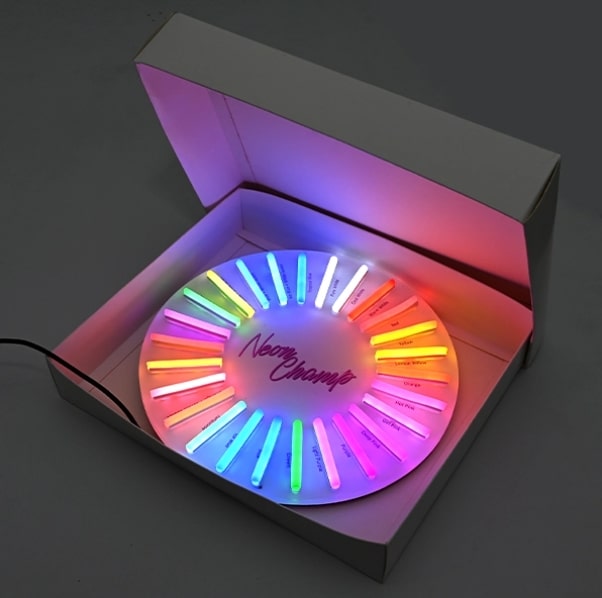
Designers often look at a neon color wheel to visualize how each shade interacts. This tool helps you identify neon colors that go together and ensure your combinations are both appealing and balanced.
1. Exploring Bright Neon Colors:
If you love designs that pop, focus on bright neon colors. These tones draw immediate attention, making them perfect for nightlife businesses, signage, or bold event decor.
The brightest neon color often depends on the pigment, but neon yellow and neon green usually top the chart for visibility. When you use these shades in moderation, they highlight focal points beautifully without overwhelming the design.
2. Understanding Neon Light Colors:
When applied to LED tubes or acrylic signs, neon light colors can look slightly different than digital or print shades. That’s why testing samples or mock-ups before finalizing your neon sign colors is essential. A neon pink on-screen may appear warmer when illuminated, while neon blue might shift toward aqua.
For businesses creating custom neon signs, always preview your chosen tones in both daylight and low-light settings. This ensures consistency and keeps your display vibrant in every environment.
The Role of a Neon Color Scheme
Every strong design starts with a thoughtful neon color scheme. Think of it as your visual language. A well-balanced scheme can convey moods-energetic, retro, calming, or futuristic.
To get started, explore neon palettes that match your theme. For example:
- Retro-inspired neon palettes combine turquoise, pink, and purple.
- Minimalist palettes use soft white with a single pop of electric blue.
- Party or nightlife palettes often include multicolor glows for a lively vibe.
If you prefer structured harmony, a neon color chart can guide you toward the most visually compatible tones.
What Are Some Neon Colors?
If you’re new to the neon world, you might wonder what are some neon colors beyond the basics. Here are popular shades used in modern design:
- Neon pink
- Neon cyan
- Neon orange
- Neon purple
- Neon yellow
- Neon lime
Each color adds its own personality. For instance, pink feels playful, green gives a natural vibe, and orange brings warmth and enthusiasm.
Choosing a Fluorescent Neon Color Palette
When aiming for high visibility, a fluorescent neon color palette is your best friend. These tones have a reflective quality that captures light and enhances brightness. They work great for outdoor advertising, nightclubs, or festivals.
Mixing multiple fluorescents can be tricky, so try using a neon color wheel to maintain harmony. Combining too many bright shades might create visual clutter, so balance them with darker or neutral tones.
1. Mixing Neon Color Combos That Work:
Perfecting neon color combos takes practice. The secret is balance. You can pair one dominant neon shade with a secondary tone and a neutral accent.
For example:
- Neon pink with black and white
- Neon blue with gray and silver
- Neon yellow with navy and tan
These best neon color combinations are bold yet stylish. They help maintain focus on the neon glow without overpowering your entire design.
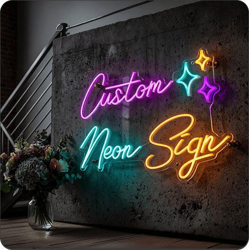
2. Playing with Neon Retro Color Palettes:
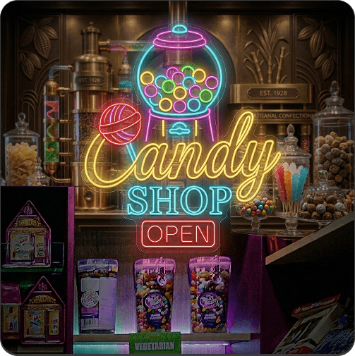
If you love vintage vibes, a neon retro color palette might be your match. Think Miami nights, 80s arcade signs, and synthwave-inspired hues. These palettes often feature magenta, cyan, and violet with deep blue backdrops.
Retro palettes work beautifully for signage and branding that aims to spark nostalgia while staying trendy. For extra contrast, you can pair them with a neon bright color palette to modernize the look.
3. Using a Neon Color Chart for Precision:
Designers often rely on a neon color chart to standardize their projects. It’s like a paint guide showing exact color codes and brightness levels. Using this chart ensures that your digital and physical signs match perfectly. For example, the neon yellow color palette varies from soft lemon to intense fluorescent yellow. By referencing color codes, you can pick tones that match your brand or mood more accurately.
4. Creative Neon Color Combos for Every Mood:
Here are a few mood-based ideas for your neon color palette:
- Energetic: Neon pink + bright blue + lime green
- Romantic: Soft pink + warm white + peach
- Modern: Cyan + charcoal gray + white
- Playful: Neon yellow + sky blue + coral
If you want to experiment further, look up neon green color combinations that blend nature’s freshness with electric vibrance.
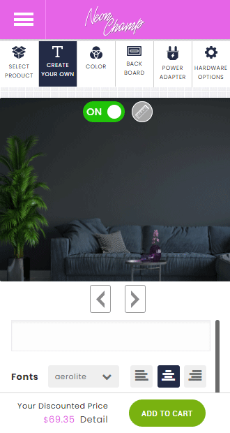
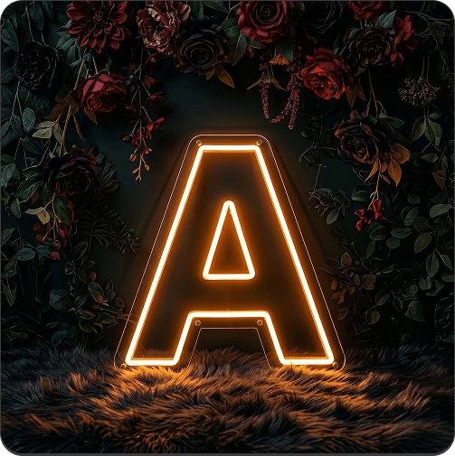
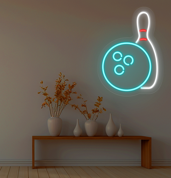
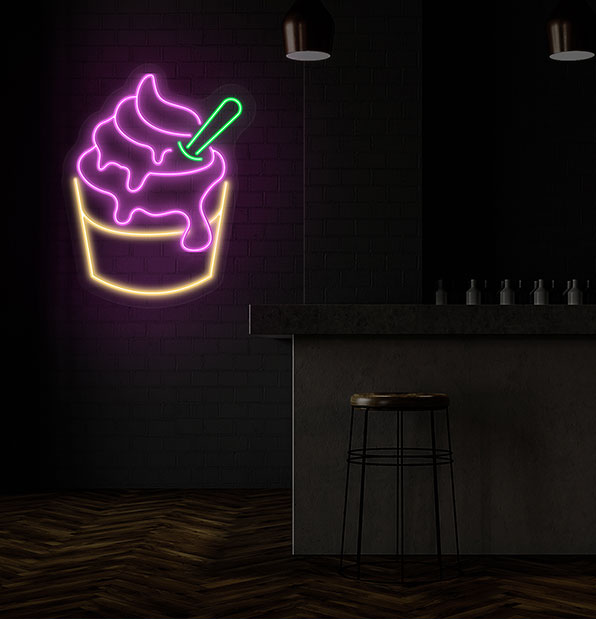
5. Building Neon Palettes for Custom Neon Signs:
When designing custom neon signs, consider readability, background color, and ambience. For indoor signage, cooler tones like blue or purple work well. For outdoor use, warm shades such as red, orange, or yellow grab attention faster.
Make sure your neon sign colors complement the environment. A dark wall enhances bright tones, while a white wall pairs best with deep or dual-color glows. Always preview your final design under actual lighting conditions to ensure it meets your expectations.
How to Pick Neon Colors That Go Together
Choosing neon colors that go together is about harmony. If two shades clash, one may overpower the other. Use contrasting tones from opposite sides of the neon color wheel for balance or go for analogous hues for a subtle flow.
For example:
- Neon purple and lime green create strong contrast.
- Neon pink and orange deliver warmth and unity.
Experiment with your neon color scheme until you find one that matches your mood and design goal.
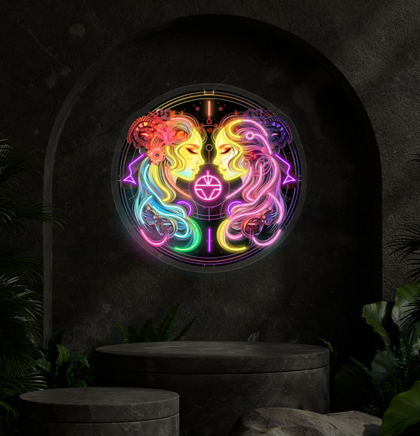
The Power of Neon Bright Color Palettes
A neon bright color palette adds life to any visual. It’s a favorite among modern brands, artists, and event planners. The glowing tones catch attention instantly and make digital graphics more engaging.
However, too many bright tones can strain the eyes. Limit your palette to two or three vibrant colors supported by neutrals. This approach highlights the neon effect without making it chaotic.
Bringing It All Together
Designing with neon colours is about creativity, energy, and expression. From retro themes to futuristic signs, every color has its story. The perfect neon color palette will not only reflect your vision but also set the right mood for your space or brand.
Whether you’re exploring neon color combos, referencing a neon color chart, or finalizing shades for custom neon signs, keep one rule in mind-simplicity amplifies glow. Start small, experiment, and watch your neon dreams light up with brilliance.
FAQs About Neon Color Palettes
1. What colors are considered neon?
Neon shades include pink, yellow, green, blue, orange, and purple. They appear ultra-bright due to fluorescent pigments that make them glow.
2. What are the best neon color combinations for signs?
Neon pink and blue, yellow and black, or purple and white are among the best neon color combinations for visibility and balance.
3. How can I choose neon colors that go together?
Use a neon color wheel to see which hues complement or contrast well. Testing your combination under actual light helps ensure harmony.
4. What is the brightest neon color?
Lime green and yellow are usually the brightest neon color choices. They’re ideal for designs that need maximum visibility.
5. Can I mix multiple neon shades in one design?
Yes, but stick to a planned neon color scheme. Too many tones can overpower your design, so balance bright shades with neutral accents.
Get 25% OFF on All ProductsCode:NEON25View Offers!
Neon Collection50% OFF