How to Choose the Right Neon Light Colors for Your Sign | Neon Guide

Color is the first thing people notice in a neon sign. Before anyone reads the text or notices the font, the color sets the tone.
That’s why choosing the right neon color is not just about what looks good. It’s about visibility, mood, and how the sign fits into its surroundings.
This guide breaks down how to choose neon light colors that actually work, whether you’re designing for décor, branding, or events.
Why Do Neon Light Colors Matter So Much?
Neon signs are built around light. That means color doesn’t just sit on the surface, it defines the entire visual experience.
The right color can:
- Make your sign stand out instantly
- Set the mood of a space
- Improve readability from a distance
- Strengthen brand identity
The wrong color can do the opposite. It can blend into the background, feel too harsh, or make the text hard to read.
When designing custom neon signs, color should never be an afterthought. It should be a starting point.

How Do Different Neon Colors Affect Mood and Feel?
Every color creates a different emotional response. That’s why the same design can feel completely different depending on the shade you choose.
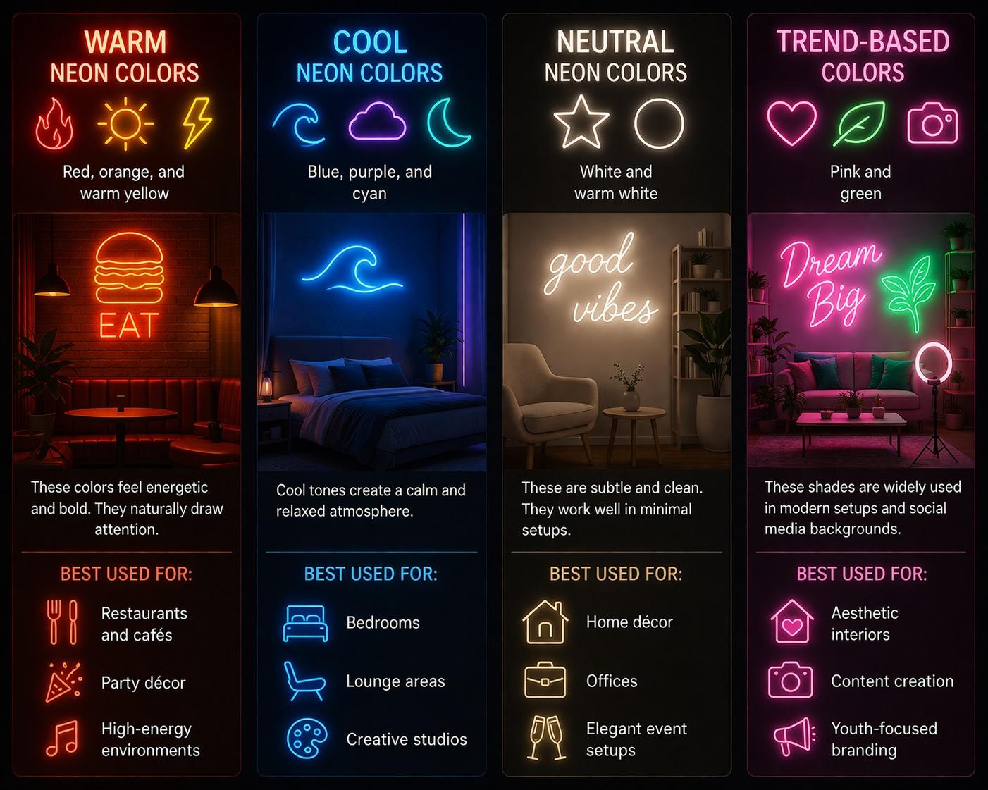
Warm Neon Colors
Red, orange, and warm yellow
These colors feel energetic and bold. They naturally draw attention.
Best used for:
- Restaurants and cafés
- Party décor
- High-energy environments
Cool Neon Colors
Blue, purple, and cyan
Cool tones create a calm and relaxed atmosphere.
Best used for:
- Bedrooms
- Lounge areas
- Creative studios
Neutral Neon Colors
White and warm white
These are subtle and clean. They work well in minimal setups.
Best used for:
- Home décor
- Offices
- Elegant event setups
Trend-Based Colors
Pink and green
These shades are widely used in modern setups and social media backgrounds.
Best used for:
- Aesthetic interiors
- Content creation
- Youth-focused branding
How Do You Choose the Right Neon Color for Your Space?
Instead of picking a color randomly, think about how it interacts with the environment.
Key factors to consider:
- Wall color
Dark walls make neon colors pop more, while light walls need stronger contrast - Lighting conditions
A sign in a dim room appears brighter than one in a well-lit space - Purpose of the sign
Decorative signs can be subtle, but business signage needs stronger visibility - Viewing distance
Bright, bold colors work better for long-distance visibility
A color that looks great in isolation may not work once placed in your actual space.
Which Neon Colors Are the Brightest and Most Visible?
Some colors naturally stand out more than others.
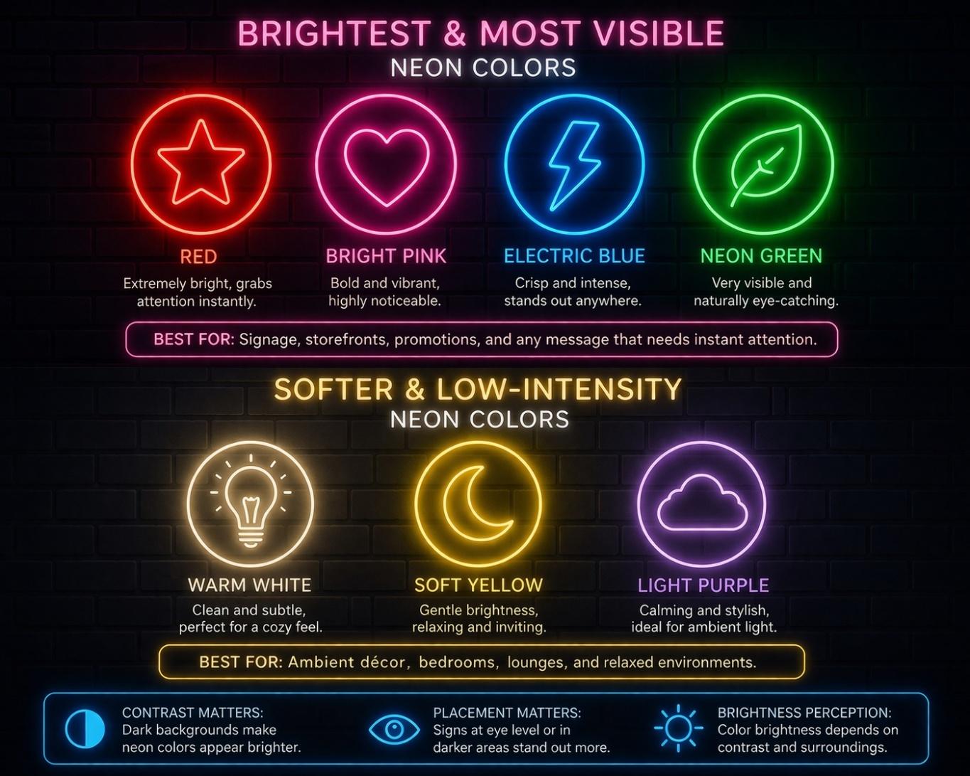
High-visibility neon colors:
- Red
- Bright pink
- Electric blue
- Neon green
These colors are ideal for signage that needs to grab attention quickly.
Softer, low-intensity colors:
- Warm white
- Soft yellow
- Light purple
These are better suited for ambient décor rather than high-visibility use.
When designing LED neon signs, brightness perception also depends on contrast and placement, not just the color itself.
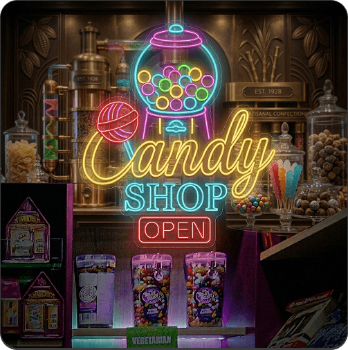
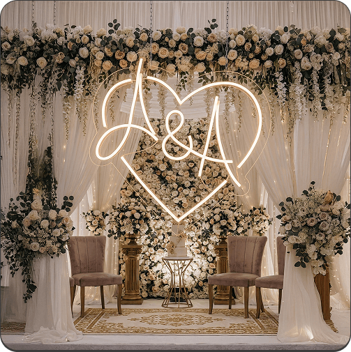
Should You Choose One Color or Multiple Colors?
Single-color neon signs are simple and clean. They are easy to read and work in almost any setting.
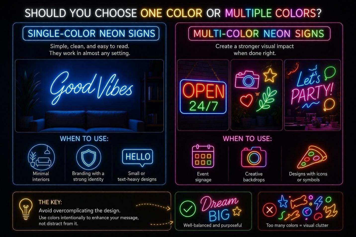
But multi-color designs can create a stronger visual impact when done right.
When to use a single color:
- Minimal interiors
- Branding with a strong identity
- Small or text-heavy designs
When to use multiple colors:
- Event signage
- Creative backdrops
- Designs with icons or symbols
The key is to avoid overcomplicating the design.
How Do You Pick Neon Colors That Match Your Brand?
If you're designing for a business, color consistency matters.
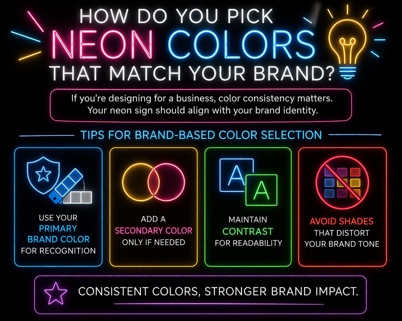
Your neon sign should align with your brand identity.
Tips for brand-based color selection:
- Use your primary brand color for recognition
- Add a secondary color only if needed
- Maintain contrast for readability
- Avoid shades that distort your brand tone
For example, a luxury brand may prefer warm white or gold tones, while a youth-focused brand may use bright pink or neon green.
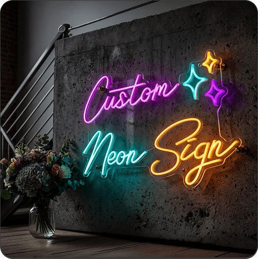
What Are the Best Neon Color Combinations?
Combining colors can enhance your design, but only when done carefully.
Popular and effective combinations:
- Pink + Blue
Vibrant and modern - Purple + Cyan
Futuristic and bold - White + Warm Yellow
Soft and elegant - Red + White
Strong and attention-grabbing
What to avoid:
- Too many colors in one design
- Low contrast combinations
- Colors that clash visually
If you want to explore combinations in more detail, you can check out our guide on neon color combinations that work well together.
How Does Background Affect Neon Color Visibility?
Your background plays a major role in how your neon sign looks.
General rules:
- Dark backgrounds increase brightness perception
- Light backgrounds require stronger colors
- Textured walls can diffuse the glow
- Reflective surfaces can enhance brightness
For example, a white neon sign may look subtle on a white wall but striking on a dark one.
How to Test Neon Colors Before Finalizing Your Design
Before placing your order, it’s important to preview your design.
Check for:
- Readability from a distance
- Contrast with background
- Overall brightness
- Mood and visual appeal
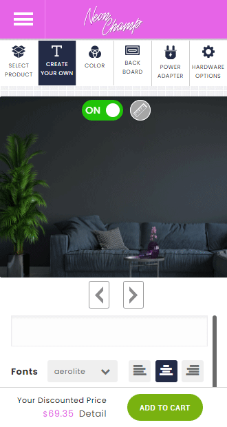
Most custom LED neon sign tools allow real-time previews, making it easier to experiment with different colors.
Common Mistakes to Avoid When Choosing Neon Colors
Even simple designs can go wrong with poor color choices.
Watch out for:
- Choosing colors based only on trends
- Ignoring background contrast
- Using too many colors
- Picking shades that reduce readability
A well-balanced color choice always performs better than an overly creative one.
FAQs About Neon Light Colors
What is the brightest neon color?
Red, bright pink, and electric blue are among the most visible neon colors.
Which neon color is best for home décor?
Warm white, soft yellow, and pastel tones work well for home setups.
Can I mix multiple neon colors in one sign?
Yes, but it’s best to limit it to two or three colors for clarity.
Do neon colors look different in real life?
Yes, lighting conditions and background can affect how colors appear.
How do I choose a neon color for branding?
Stick to your brand colors and ensure good contrast for readability.
Final Thoughts on Choosing Neon Light Colors
Color is what gives your neon sign its personality. It determines how it feels, how it stands out, and how well it fits into your space.
Instead of picking what looks good in isolation, think about context. Consider your environment, purpose, and audience.
With the right approach, you can create custom neon signs that not only glow, but truly enhance the space around them.
Get 25% OFF on All ProductsCode:NEON25View Offers!
Neon Collection50% OFF