A Guide to the Best Fonts for Neon Signs That Stand Out

A neon sign is more than glowing text on a wall. The font you choose decides how the sign feels, how clearly people can read it, and how well it fits the space. A soft handwritten font can make a name sign feel personal. A clean font can suit an office or retail store. A bold font can help a sign stand out in a busy room or storefront.
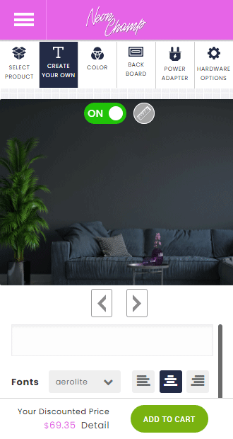
When designing neon signs, the right font should look good and stay readable after it is made with LED neon tubing. Some fonts look attractive in a digital preview but become crowded once the glow is added. Others may look too thin, too wide, or too decorative for the final sign. This guide will help you choose from the font options available in the NeonChamp design tool and use them for the right type of sign.
Why Font Choice Matters for Custom Neon Signs
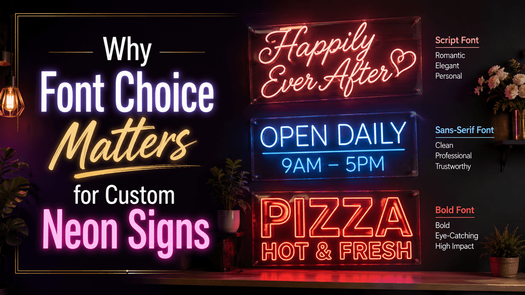
Font choice affects the first impression of your sign. A romantic font like Cangeline, Dailymont, Halimun, or Loverine can suit names, weddings, bedrooms, and proposal decor. A clean font like Roboto, Aerolite, Havelock, or Geliat works better for modern rooms, business names, office signs, and clear messages.
Readability is just as important as style. Neon signs are often viewed from across the room, behind a reception desk, above a store counter, or in photos. If the letters are too close, too thin, or too decorative, the message may not be clear. A good font helps people understand the sign quickly.
The font also affects how the glow appears. Smooth curves, balanced spacing, and clear strokes help neon signs look cleaner. For a Custom Made Neon Sign, the best font is one that matches the message, works with the sign size, and stays easy to read after lighting.
What Makes a Font Suitable for Neon Signs?
A good neon font should have clear letter shapes. Each letter should be easy to identify, even when the sign is glowing. Fonts such as Roboto, Havelock, Geliat, Znikomit, and Aerolite are helpful when the sign needs a neat and simple look.
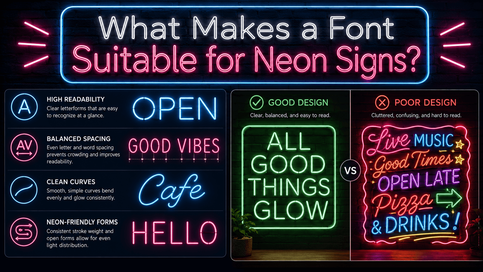
Spacing also matters. Neon tubing needs enough room between letters so the glow does not make words look joined together. Script fonts like Great Day, Boarding, Beyond Infinity, and Halimun can look beautiful, but they usually work better with short phrases and larger sign sizes.
A suitable neon font should also match the purpose of the sign. A business sign needs clarity. A wedding sign needs softness. A bar or cafe sign may need a retro feel. A home decor sign can be playful, romantic, or minimal, depending on the room.
6 Best Font Styles for Neon Signs
Different font styles work for different messages. Use the groups below to choose a font based on the mood, purpose, and length of your neon sign text.
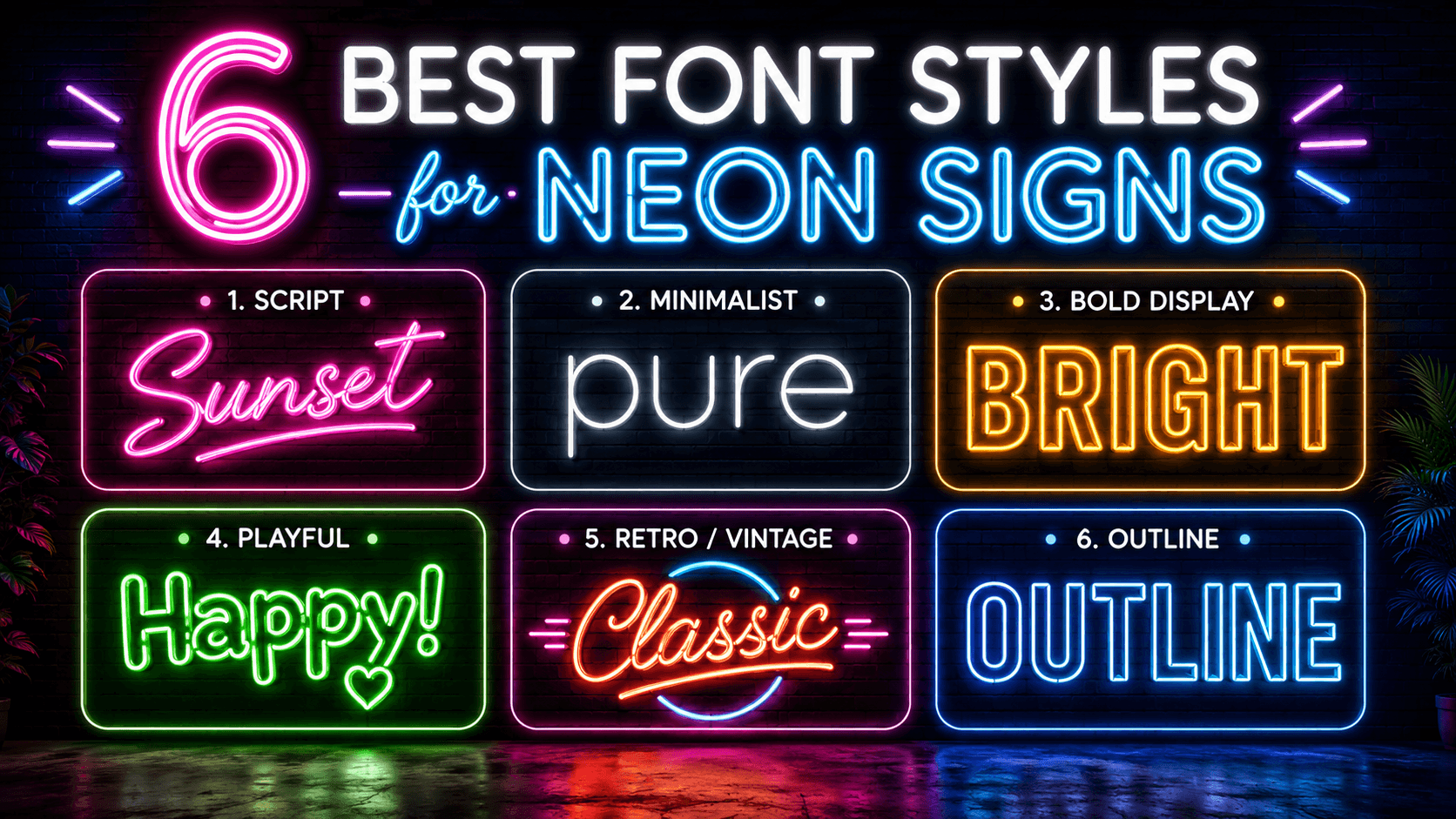
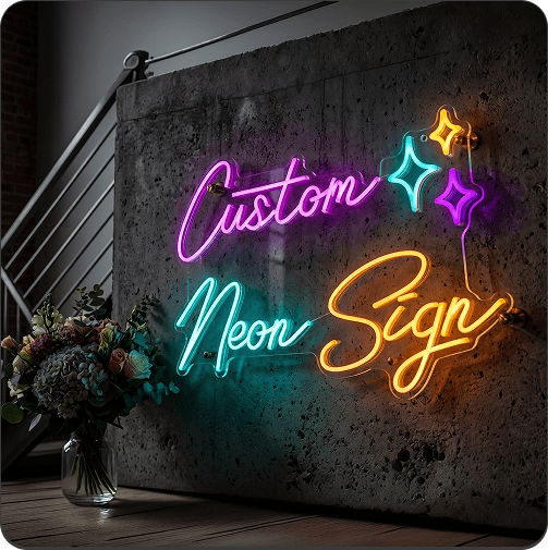
1. Script and Handwritten Fonts for Neon Signs
Script and handwritten fonts are popular for neon signs because they feel personal and stylish. They work well for names, short quotes, wedding backdrops, bedrooms, proposals, and event decor.
Good options include Anjelika Rose, Baleno Handi, Beyond Infinity, Boarding, Cangeline, Cursive Standard, Dailymont, Great Day, Halimun, Loverine, Salute, Shelby, Shaker, HTNeon, Heiders, and Local Brewery.
Cangeline and Dailymont are great for elegant signs. Great Day and Halimun feel soft and personal. Loverine, Shelby, and Anjelika Rose are good for romantic signs. Use these fonts for short text so the letters do not feel crowded.
2. Minimalist Fonts for Clean Neon Signs
Minimalist fonts are best when you want a simple and modern sign. They are easy to read and work well for homes, offices, salons, studios, retail stores, and brand walls.
Good options include Aerolite, Roboto, Geliat, Havelock, Znikomit, Pseudo, and NightLightSquare.
Roboto is one of the safest choices for clear wording. Aerolite gives a light modern feel. Havelock looks sharp and clean. Geliat and Znikomit are good for simple signs that still need style. These fonts work well when the message needs to be read quickly.
3. Bold Display Fonts for High Visibility Neon Signs
Bold display fonts help a sign stand out. They are useful for short words, storefront signs, gaming rooms, event signs, bars, trade shows, and promotional displays.
Good options include Election Day, Fenwick Outline, Galledis, Bourton, RM Smoothsans, Dress Quote, Neon Summer, and Havelock.
Election Day has a strong block style. Galledis and Havelock give a clean bold look. Bourton feels sturdy and vintage. Neon Summer works well for bright and fun signs. These fonts are best for short phrases because longer wording can look heavy.
4. Playful Fonts for Fun Neon Signs
Playful fonts are a good choice when the sign needs charm and personality. They suit kids’ rooms, game rooms, birthday parties, creative studios, photo booths, and casual event backdrops.
Good options include Chocolate Raindrops, CraftyGirlsPro, Heiders, Shaker, Neon Summer, Dress Quote, and Local Brewery.
Chocolate Raindrops is fun for kids’ rooms and quirky phrases. CraftyGirlsPro feels casual and hand drawn. Neon Summer gives a bright party feel. Keep the message short so the font stays clear.
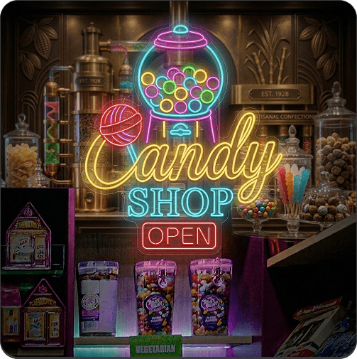
5. Retro and Vintage Style Fonts for Neon Signs
Retro fonts work well when you want an old school or classic sign feel. They suit cafes, bars, diners, music rooms, tattoo studios, restaurants, home bars, and themed decor.
Good options include Valgel, Bourton, Local Brewery, Great Day, Neon Summer, Election Day, and Salute.
Bourton is a strong choice for cafe or bar signs. Local Brewery naturally suits bars and restaurants. Valgel feels classic and simple. Great Day and Salute can add a soft vintage touch. These fonts often look good with warm white, red, orange, or yellow neon colors.
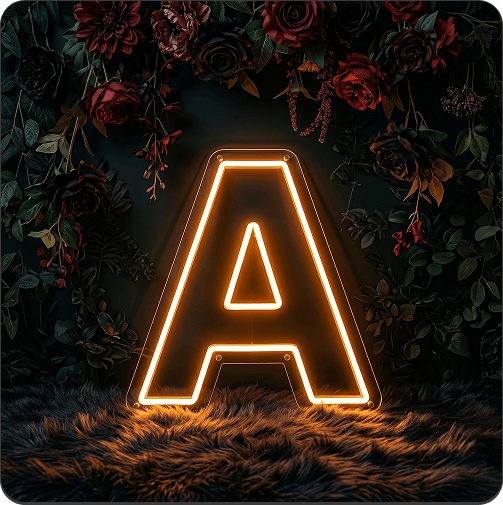
6. Outline Fonts for Neon Signs
Outline fonts create a bold and graphic look. They can make a sign feel modern, structured, and different from regular text signs.
Good options include Fenwick Outline, RM Smoothsans, Dress Quote, and Election Day.
Fenwick Outline works well for short names and display words. RM Smoothsans gives a clean outlined style. Dress Quote feels more fun and casual. Outline fonts usually need a larger sign size because small letters may lose detail after lighting.
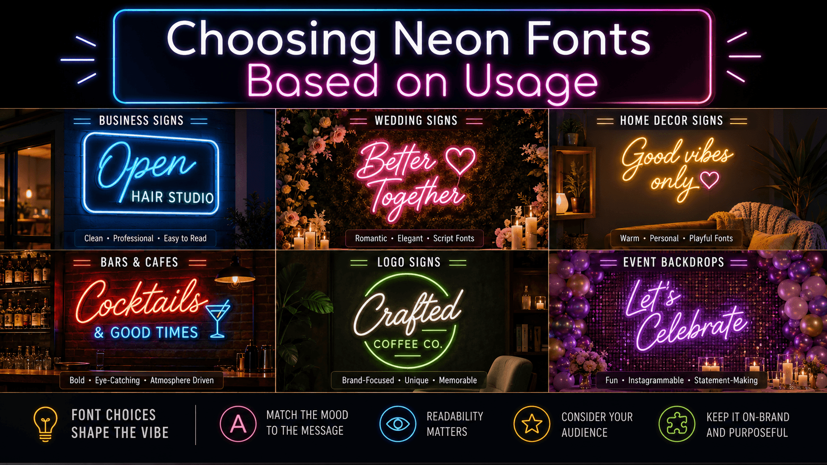
Choosing Neon Fonts Based on Usage
The best font depends on where the sign will be used. A wedding sign needs a softer look, while a business sign needs fast readability. A logo sign should match the brand, and a home sign can be more personal. Use this table to choose neon fonts based on common use cases.
|
Usage |
Best Font Style |
Suggested Fonts |
Best For |
|
Business signs |
Minimalist, bold display |
Roboto, Havelock, Galledis, Election Day, RM Smoothsans |
Shops, offices, salons, reception areas |
|
Wedding signs |
Script, handwritten |
Cangeline, Dailymont, Great Day, Halimun, Loverine, Anjelika Rose |
Couple names, last names, reception decor |
|
Home decor signs |
Minimalist, script, playful |
Aerolite, Roboto, Shelby, Shaker, Baleno Handi, Pseudo |
Bedrooms, living rooms, kids’ rooms |
|
Bars and cafes |
Retro, vintage, bold |
Local Brewery, Bourton, Valgel, Neon Summer, Salute |
Cafe walls, bar signs, restaurant decor |
|
Logo signs |
Clean, bold, brand friendly |
Roboto, Havelock, Geliat, Galledis, Bourton |
Brand names, office walls, retail displays |
|
Event backdrops |
Script, playful, bold |
Great Day, Cangeline, Neon Summer, Dress Quote, CraftyGirlsPro |
Parties, photo walls, stage decor |
Choose Business Neon Signs fonts for clarity, Wedding Neon Signs fonts for softness, and Logo Neon Signs fonts for brand recall. If you already have finished artwork, use Upload Your Logo/Design instead of recreating it with typed text.
Fonts to Avoid When Designing a Neon Sign
Some fonts may look good on screen but may not work well in neon. Avoid font choices that make the sign hard to read, too crowded, or unclear after lighting.
Fonts with overly thin strokes
Very thin fonts may look weak in neon. They can lose visibility from a distance and may not glow as strongly. For a clean look, choose Roboto, Havelock, Aerolite, or Geliat instead.
Fonts with too many small details
Fonts with tiny loops, extra lines, or tricky letter shapes can become unclear in neon. Keep detailed fonts for very short wording only.
Fonts that are hard to read in uppercase
Some script fonts look better in lowercase or title case. Cangeline, Dailymont, Halimun, Loverine, and Great Day may feel less natural in all caps.
Fonts that look crowded with longer text
Long quotes need clean fonts. Roboto, Aerolite, Geliat, and Havelock are safer for longer wording than very decorative script fonts.
Fonts that lose shape when scaled down
Outline and decorative fonts need enough size to stay readable. Fenwick Outline, Dress Quote, and RM Smoothsans may work better for larger signs than small ones.
How Font Size, Letter Spacing, and Word Length Affect Neon Sign Readability
A good font can still look unclear if the size, spacing, or word count is not right. Before ordering neon signs, check how the words will look from the viewing distance.
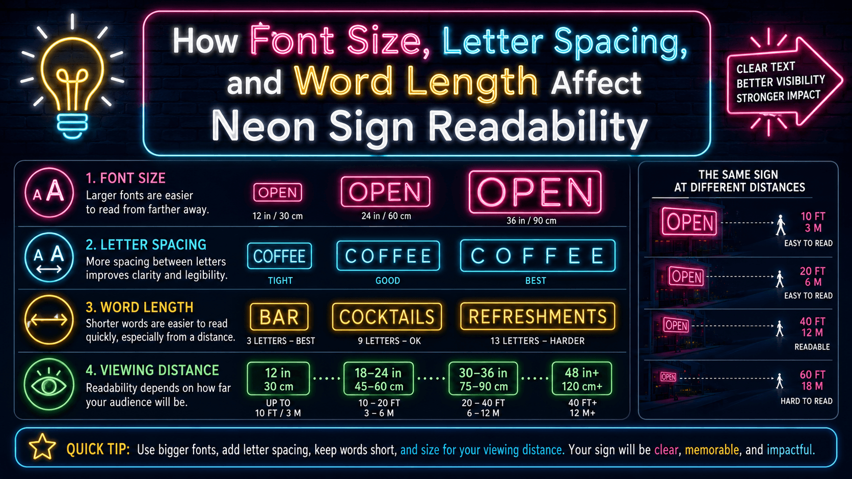
Why short words usually work better
Short words are easier to read in neon. Names, initials, brand names, and small phrases give each letter enough space to glow clearly.
How font size changes the final look
Larger signs give more room for curves, loops, and outlines. Smaller signs need simpler fonts so the letters stay clear.
Why letter spacing matters in neon signs
Spacing prevents letters from blending together. Script fonts often need more room, while minimalist fonts can work with tighter spacing.
When to use uppercase, lowercase, or mixed case
Uppercase works well for bold fonts like Election Day, Havelock, and Galledis. Lowercase or mixed case works better for script fonts like Cangeline, Dailymont, and Halimun.
How viewing distance affects font choice
A sign seen from far away needs a simple or bold font. A sign seen up close can use softer script or playful styles.
Should You Use One Font or Mix Two Fonts in a Neon Sign?
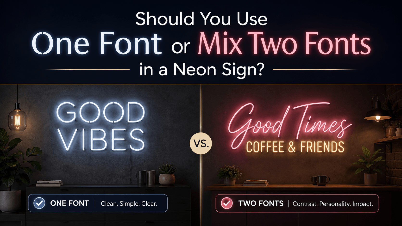
One font is usually the safest choice for neon signs. It keeps the design clean, readable, and easy to place on a wall. This works well for names, quotes, brand names, bedroom signs, and office signs.
Mixing two fonts can work when you want contrast. For example, a couple’s names can use Cangeline or Dailymont, while the wedding date can use Roboto or Aerolite. A business name can use a bold font, while a short tagline uses a cleaner font.
A good pairing usually includes one decorative font and one simple font. Script plus minimalist is a safe mix. Great Day with Roboto, Halimun with Geliat, or Cangeline with Aerolite can work nicely when the layout is clean.
Avoid using more than two fonts in one sign. Too many fonts can make the sign feel messy and harder to read. Also avoid pairing two highly decorative fonts together because they may compete with each other.
How to Match Your Font with Neon Sign Color and Mood
Font and color should support each other. The same font can feel romantic, bold, calm, or playful depending on the neon color you choose.
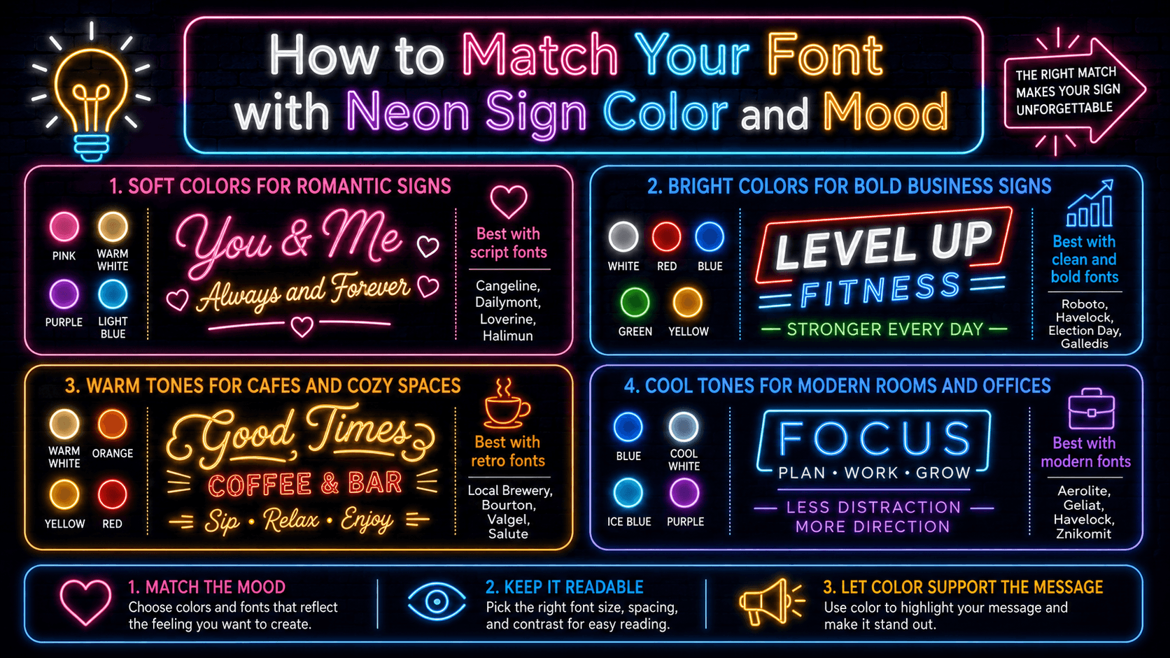
Soft colors for romantic and personal signs
Soft pink, warm white, purple, and light blue work well with script fonts. Pair them with Cangeline, Dailymont, Loverine, Great Day, Halimun, or Anjelika Rose.
Bright colors for bold business signs
Bright white, red, blue, green, and yellow can help business signs stand out. Use them with Roboto, Havelock, Election Day, Galledis, RM Smoothsans, or Bourton.
Warm tones for cafes, bars, and cozy spaces
Warm white, orange, yellow, and red suit cafes, bars, home bars, and restaurants. Pair them with Local Brewery, Bourton, Valgel, Salute, or Neon Summer.
Cool tones for modern rooms and office signs
Blue, cool white, ice blue, and purple work well in modern rooms, studios, and office spaces. Use them with Aerolite, Roboto, Geliat, Havelock, Pseudo, or Znikomit.
How font style and color work together
Script fonts often look better in softer colors. Bold fonts can handle brighter colors. Minimalist fonts are flexible and work with most shades.
How to Preview and Test Fonts Before Ordering Your Neon Sign
Always test the font with your exact words before ordering. A font may look good with one word but not with another. Letters with loops, tails, or tight curves may change the final look.
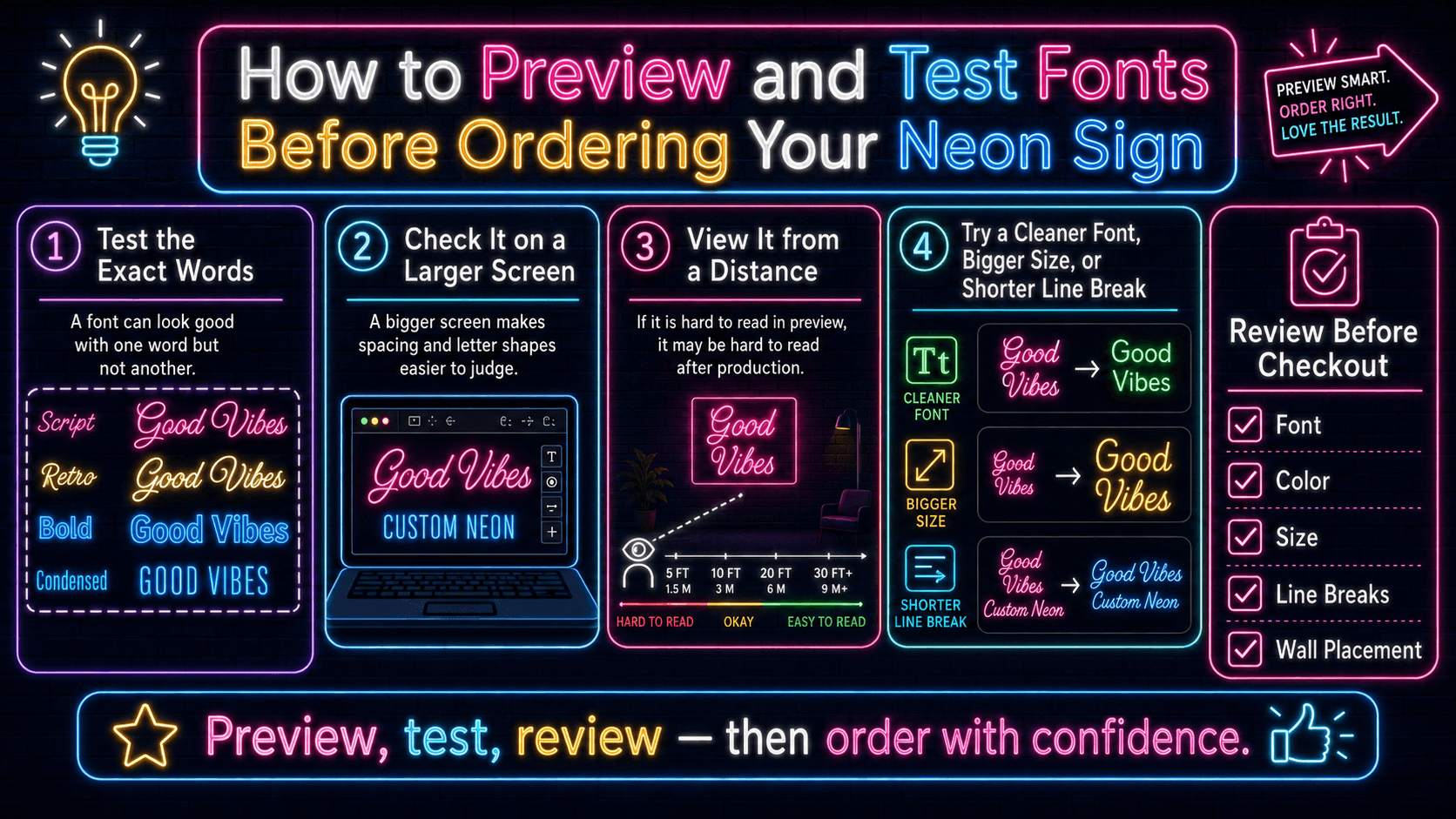
Check the sign preview on a larger screen if possible. A mobile view is helpful, but a desktop or tablet can make spacing and letter shapes easier to judge.
Look at the design from a distance. If the words are hard to read in the preview, they may also be hard to read after production. Try a cleaner font, larger size, or shorter line break.
Review the full sign before checkout. Check the font, color, size, line breaks, and wall placement. A final review can help your neon sign look clean, readable, and ready for display.
FAQs About Choosing Fonts for Neon Signs
What is the best font for neon signs?
The best font depends on the sign type. Roboto, Havelock, Aerolite, and Geliat are good for clean signs. Cangeline, Dailymont, Great Day, and Halimun are good for personal and romantic signs.
Which font is easiest to read on a neon sign?
Simple fonts are easiest to read. Roboto, Havelock, Geliat, Aerolite, and Znikomit are strong choices for clear neon signs.
Are script fonts good for neon signs?
Yes. Script fonts are great for names, weddings, bedrooms, and short quotes. Use Cangeline, Dailymont, Great Day, Halimun, Loverine, or Anjelika Rose.
What fonts work best for business neon signs?
Roboto, Havelock, Election Day, Galledis, RM Smoothsans, Bourton, and Geliat work well for business signs because they are clear and strong.
Which fonts are best for wedding neon signs?
Cangeline, Dailymont, Great Day, Halimun, Loverine, Anjelika Rose, Baleno Handi, and Shelby are good for wedding signs.
Can I use two fonts in one neon sign?
Yes, but keep it simple. Use one decorative font for the main words and one clean font for dates, taglines, or smaller text.
What font should I choose for a short quote?
For short quotes, try Great Day, Halimun, Cangeline, Loverine, Shaker, Shelby, or HTNeon. For a cleaner quote, use Roboto, Aerolite, or Geliat.
Which fonts should I avoid for custom neon signs?
Avoid fonts that are too thin, too crowded, too decorative, or hard to read in the chosen size.
Does neon sign color affect font readability?
Yes. Bright colors need clear fonts, while soft colors work well with script fonts. Font weight, sign size, and color should work together.
How do I know if my chosen font will look good before ordering?
Use the preview tool with your exact text. Check spacing, readability, color, size, and line breaks before placing your order.
Get 25% OFF on All ProductsCode:NEON25View Offers!
Neon Collection50% OFF