What Are the Best Neon Color Combinations for Signs

Choosing a single neon color is simple. Combining multiple colors is where design starts to get interesting.
The right color combination can turn a basic sign into something eye-catching and memorable. The wrong mix can make even a good design feel confusing or hard to read.
This guide walks you through how to combine neon colors in a way that looks intentional, balanced, and visually strong across different use cases.
Why Do Neon Color Combinations Matter?
Color combinations affect how your sign is perceived at first glance.
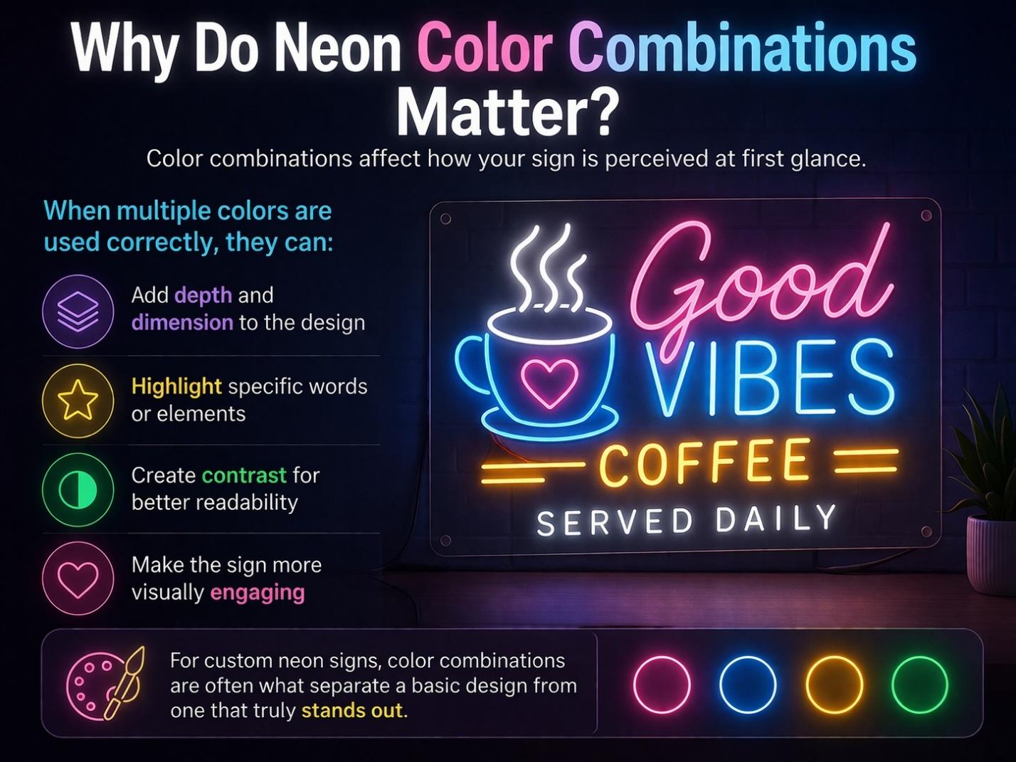
When multiple colors are used correctly, they can:
- Add depth and dimension to the design
- Highlight specific words or elements
- Create contrast for better readability
- Make the sign more visually engaging
For custom neon signs, color combinations are often what separate a basic design from one that truly stands out.
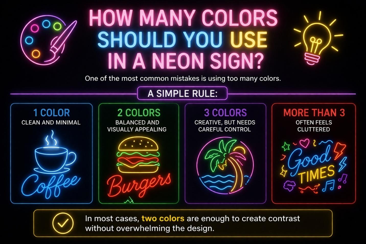
How Many Colors Should You Use in a Neon Sign?
One of the most common mistakes is using too many colors.
A simple rule:
- 1 color → clean and minimal
- 2 colors → balanced and visually appealing
- 3 colors → creative, but needs careful control
- More than 3 → often feels cluttered
In most cases, two colors are enough to create contrast without overwhelming the design.
What Makes a Neon Color Combination Work Well?
Before jumping into examples, it helps to understand what makes combinations effective.
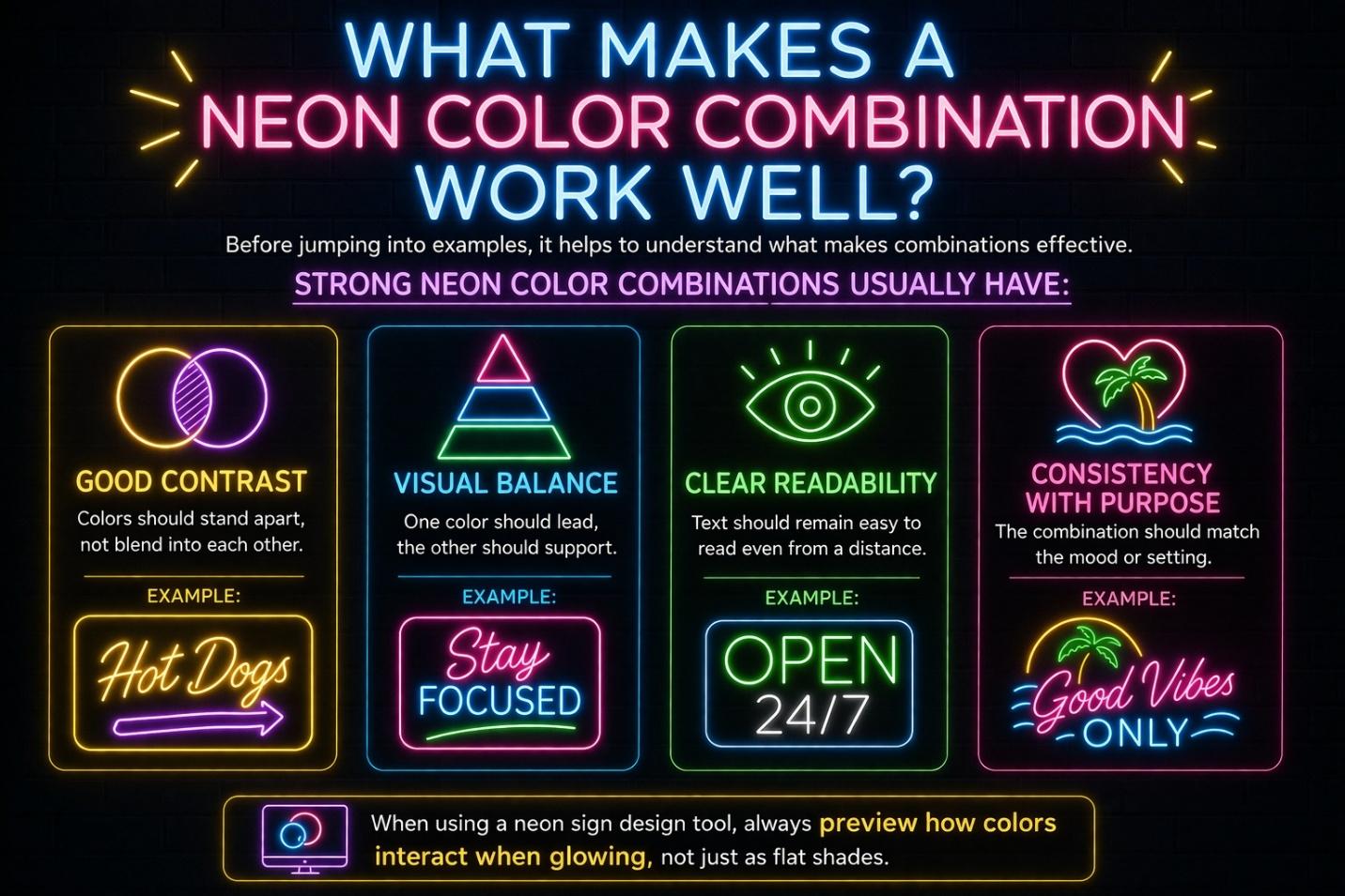
Strong neon color combinations usually have:
- Good contrast
Colors should stand apart, not blend into each other - Visual balance
One color should lead, the other should support - Clear readability
Text should remain easy to read even from a distance - Consistency with purpose
The combination should match the mood or setting
When using a neon sign design tool, always preview how colors interact when glowing, not just as flat shades.
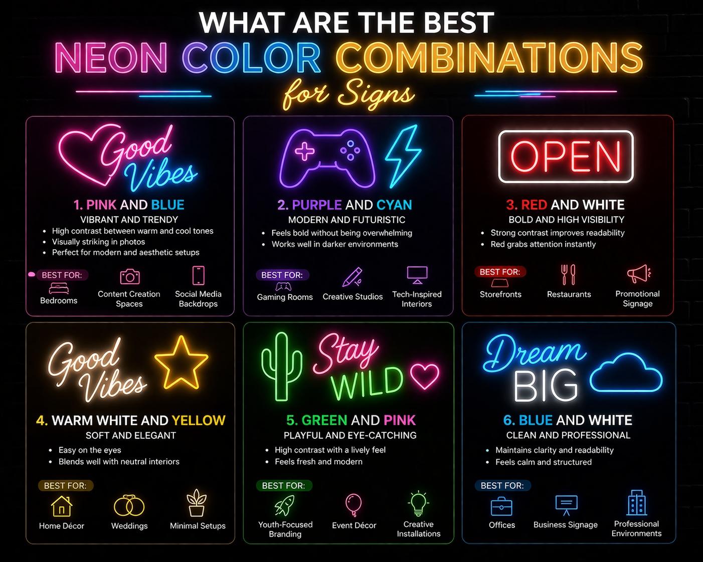
Best Neon Color Combinations That Always Work
Here are some tried-and-tested combinations that work across different spaces and styles.
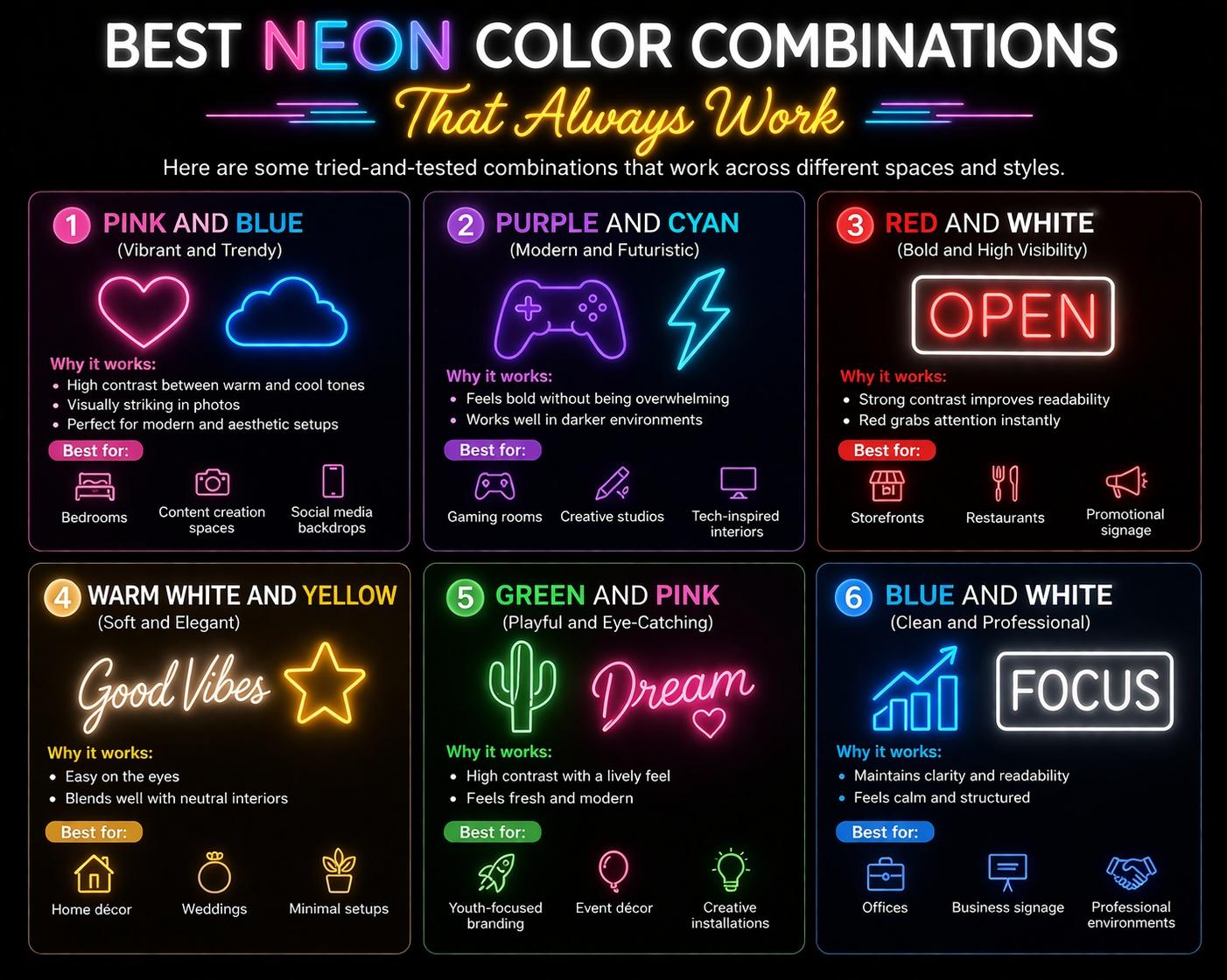
1. Pink and Blue (Vibrant and Trendy)
This is one of the most popular neon combinations.
Why it works:
- High contrast between warm and cool tones
- Visually striking in photos
- Perfect for modern and aesthetic setups
Best for:
- Bedrooms
- Content creation spaces
- Social media backdrops
2. Purple and Cyan (Modern and Futuristic)
This combination gives a sleek, digital feel.
Why it works:
- Feels bold without being overwhelming
- Works well in darker environments
Best for:
- Gaming rooms
- Creative studios
- Tech-inspired interiors
3. Red and White (Bold and High Visibility)
A classic combination often used in signage.
Why it works:
- Strong contrast improves readability
- Red grabs attention instantly
Best for:
- Storefronts
- Restaurants
- Promotional signage
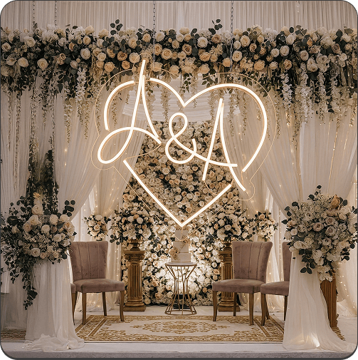
4. Warm White and Yellow (Soft and Elegant)
This pairing creates a subtle glow.
Why it works:
- Easy on the eyes
- Blends well with neutral interiors
Best for:
- Home décor
- Weddings
- Minimal setups
5. Green and Pink (Playful and Eye-Catching)
A bold combination that stands out immediately.
Why it works:
- High contrast with a lively feel
- Feels fresh and modern
Best for:
- Youth-focused branding
- Event décor
- Creative installations
6. Blue and White (Clean and Professional)
A simple yet effective combination.
Why it works:
- Maintains clarity and readability
- Feels calm and structured
Best for:
- Offices
- Business signage
- Professional environments
How Do You Choose the Right Combination for Your Space?
Instead of copying combinations, it’s better to match them with your environment.
Consider these factors:
- Wall color
Dark walls allow more flexibility, light walls need stronger contrast - Lighting conditions
Bright rooms may require more intense colors - Purpose of the sign
Decorative signs can be softer, while branding needs stronger contrast - Audience
Playful colors for casual spaces, neutral tones for formal settings
For LED neon signs, color combinations should enhance visibility without overpowering the design.
How to Use Multiple Colors Without Making the Design Look Cluttered
Combining colors is not just about picking shades. It’s about placement.
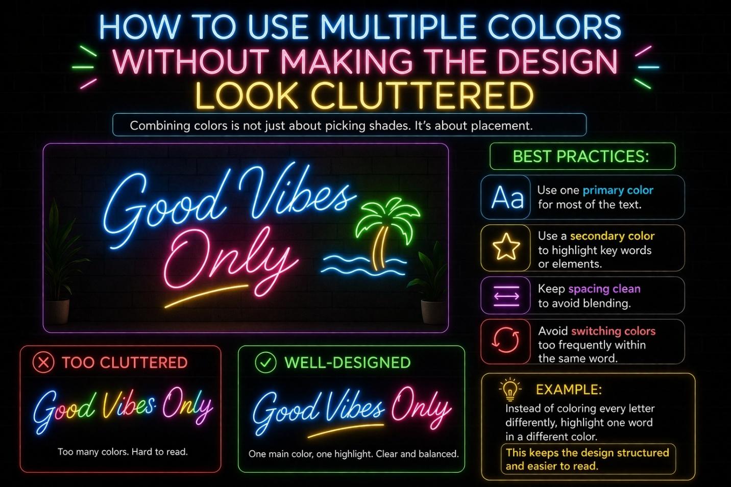
Best practices:
- Use one primary color for most of the text
- Use a secondary color to highlight key words or elements
- Keep spacing clean to avoid blending
- Avoid switching colors too frequently within the same word
Example:
Instead of coloring every letter differently, highlight one word in a different color.
This keeps the design structured and easier to read.
What Color Combinations Should You Avoid?
Some combinations may look good in theory but fail in real designs.
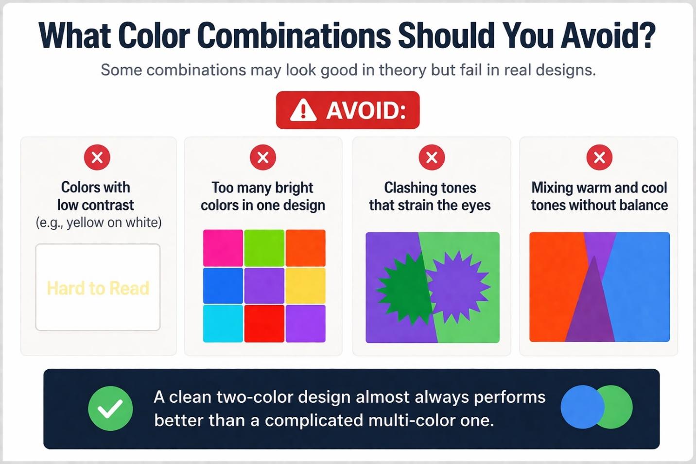
Avoid:
- Colors with low contrast (e.g., yellow on white)
- Too many bright colors in one design
- Clashing tones that strain the eyes
- Mixing warm and cool tones without balance
A clean two-color design almost always performs better than a complicated multi-color one.
How Do Color Combinations Affect Readability?
Readability is often overlooked when experimenting with colors.
Key points:
- High contrast improves readability
- Bright colors on dark backgrounds work best
- Similar tones reduce clarity
If your sign is meant to be read from a distance, prioritize contrast over creativity.
How to Preview and Test Neon Color Combinations
Before finalizing your design, testing is essential.
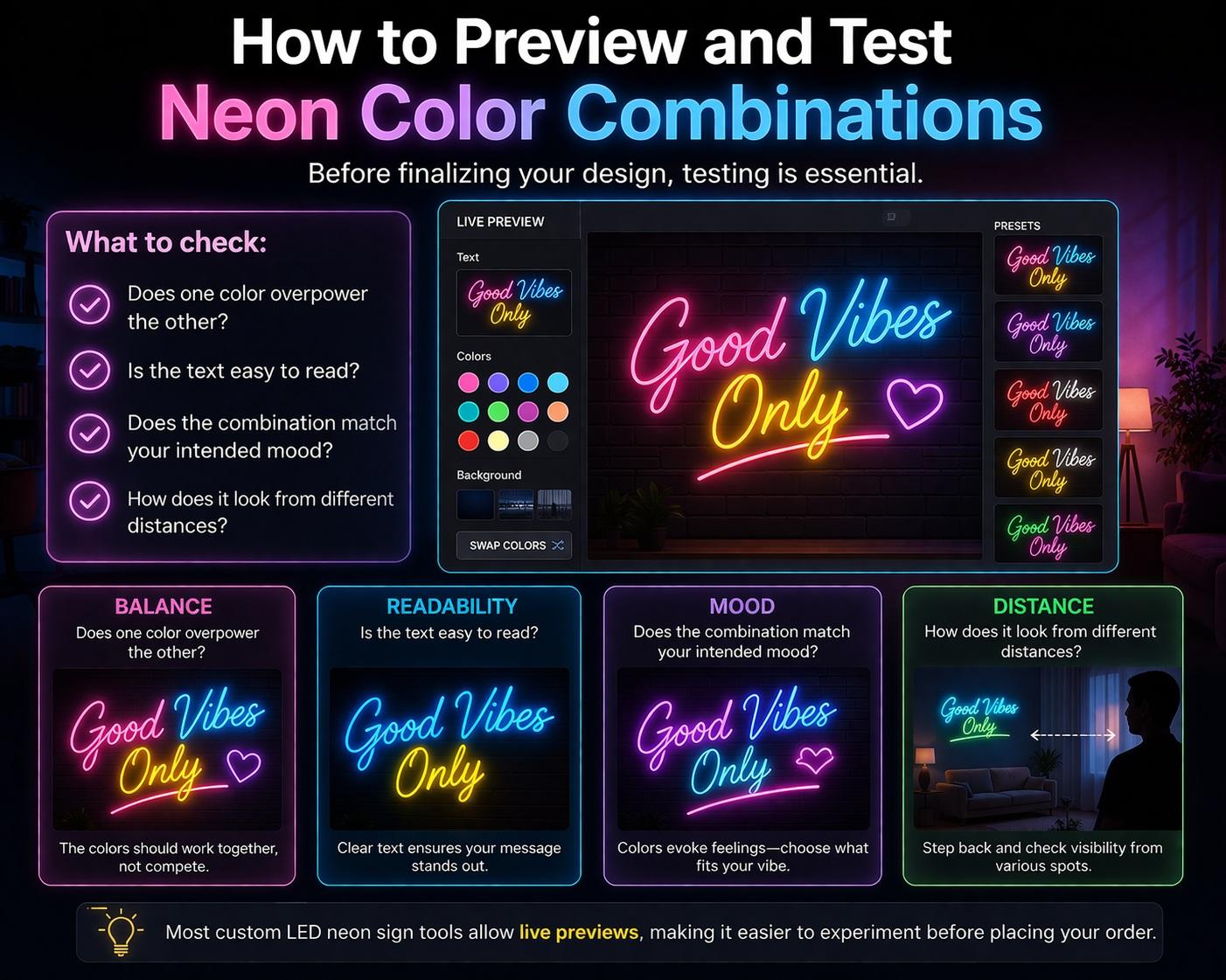
What to check:
- Does one color overpower the other?
- Is the text easy to read?
- Does the combination match your intended mood?
- How does it look from different distances?
Most custom LED neon sign tools allow live previews, making it easier to experiment before placing your order.
FAQs About Neon Color Combinations
How many colors should I use in a neon sign?
Two colors are usually enough for a clean and balanced design.
What is the most popular neon color combination?
Pink and blue is one of the most widely used combinations.
Can I use three colors in one neon sign?
Yes, but it requires careful balance to avoid clutter.
Which color combinations are best for business signage?
High-contrast combinations like red and white or blue and white work best.
Do neon colors look different in real life?
Yes, lighting and background can affect how combinations appear.
Final Thoughts on Neon Color Combinations
Color combinations can take your neon sign from simple to striking. The key is to keep things balanced.
Focus on contrast, readability, and purpose. Choose combinations that enhance your message instead of distracting from it.
With the right approach, your custom neon signs will not only glow, but create a strong visual impression that lasts.
Get 25% OFF on All ProductsCode:NEON25View Offers!
Neon Collection50% OFF