
 we're online
How to Simplify a Detailed Logo for an LED Neon Sign
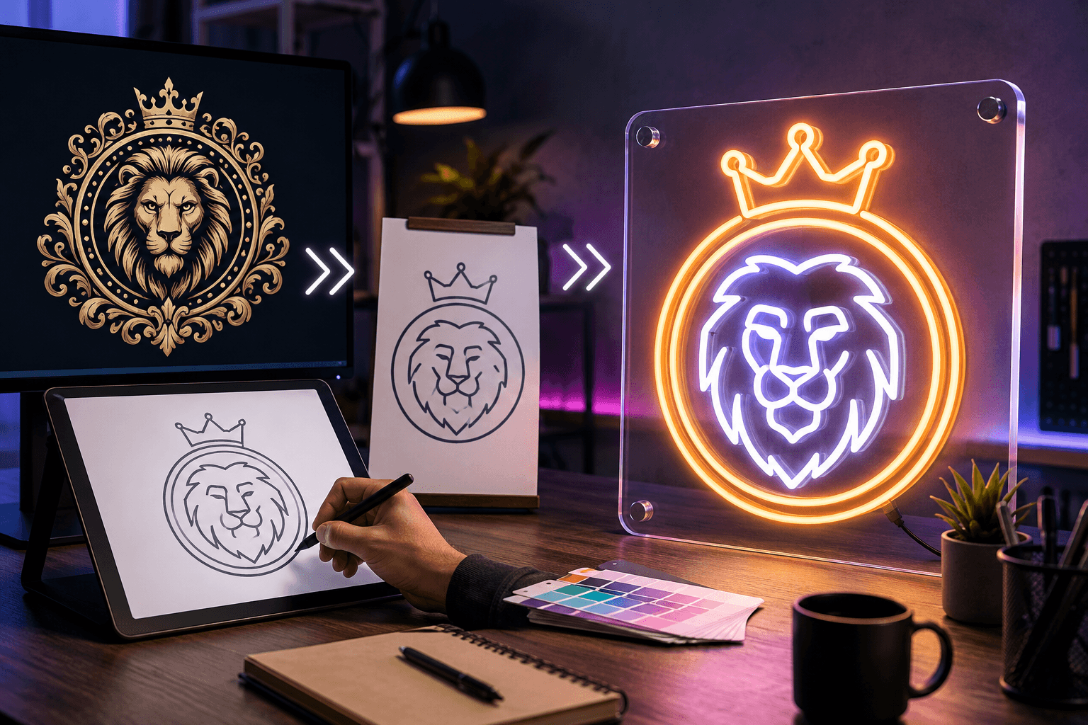
A complex logo can usually be made into an LED neon sign, but some elements may need adjustment before production. Fine lines, small text, gradients, shadows, and crowded shapes may not remain clear when converted into illuminated tubing.
The purpose of simplification is not to redesign the brand. It is to preserve the most recognizable parts of the logo and make them suitable for a physical lighted display. NeonChamp can review the uploaded artwork and identify which details should remain, be enlarged, or removed. Unlike sellers who print exactly what you upload, this review catches problem areas at the mockup stage, before production, not after the sign has already been made.
Why Complex Logos Need Some Changes
Digital and printed logos can contain details that are difficult to reproduce with LED neon. A screen can show small patterns and subtle color changes, but a physical sign needs enough room for lighting, spacing, and backing.
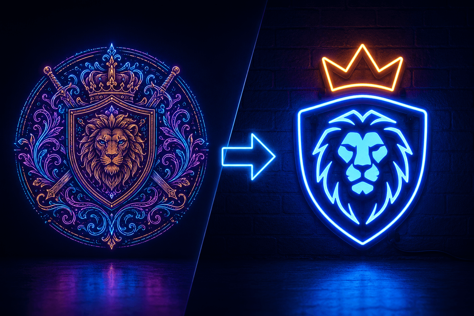
Common issues include:
- Thin or broken lines
- Small taglines
- Closely spaced letters
- Overlapping shapes
- Gradients and shadows
- Detailed illustrations
- Several colors in a small area
Simplifying these features helps a sign look cleaner once it's illuminated, and it also improves readability from a distance.
Keep the Most Recognizable Logo Elements
Identify the part of the logo that customers notice first. This may be the company name, an icon, a monogram, or a distinctive outline. That element should remain the main focus of the design.
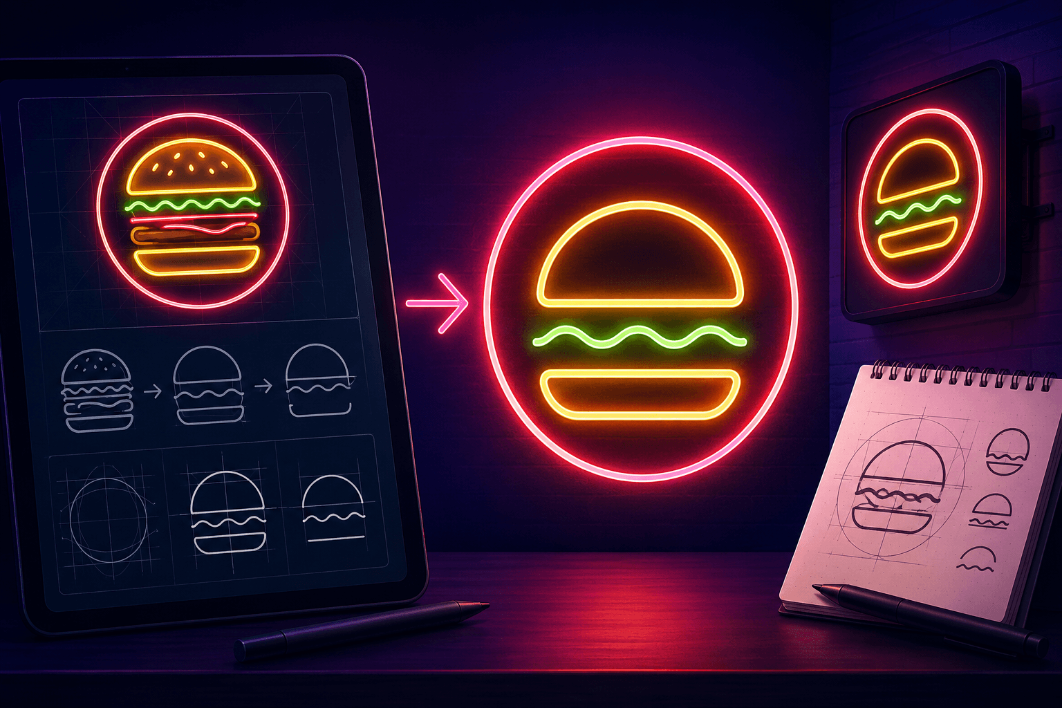
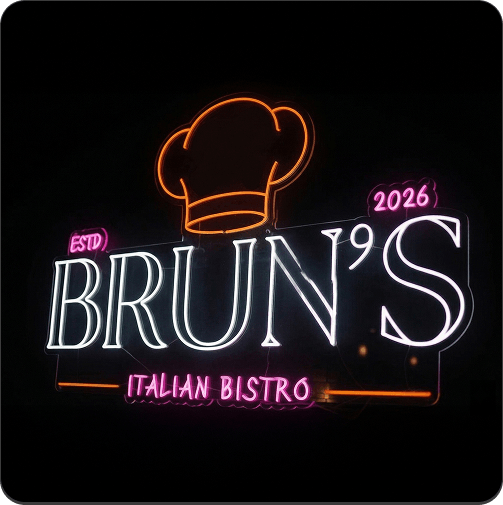
Secondary details can be reduced when they do not affect brand recognition. For example, a logo containing an icon, company name, tagline, founding year, and decorative border may work better with only the icon and company name.
Many effective logo signs use one or two strong brand elements instead of reproducing every detail, and the finished sign should still look familiar without appearing crowded. If you want to turn your logo into a neon sign of your own, this is usually the first design decision to get right.
Convert Fine Details Into Clean Shapes
Thin strokes may look weak or disappear after illumination. Increasing their thickness can create a smoother and more consistent glow. Small gaps may also need to be widened so nearby sections do not blend together.
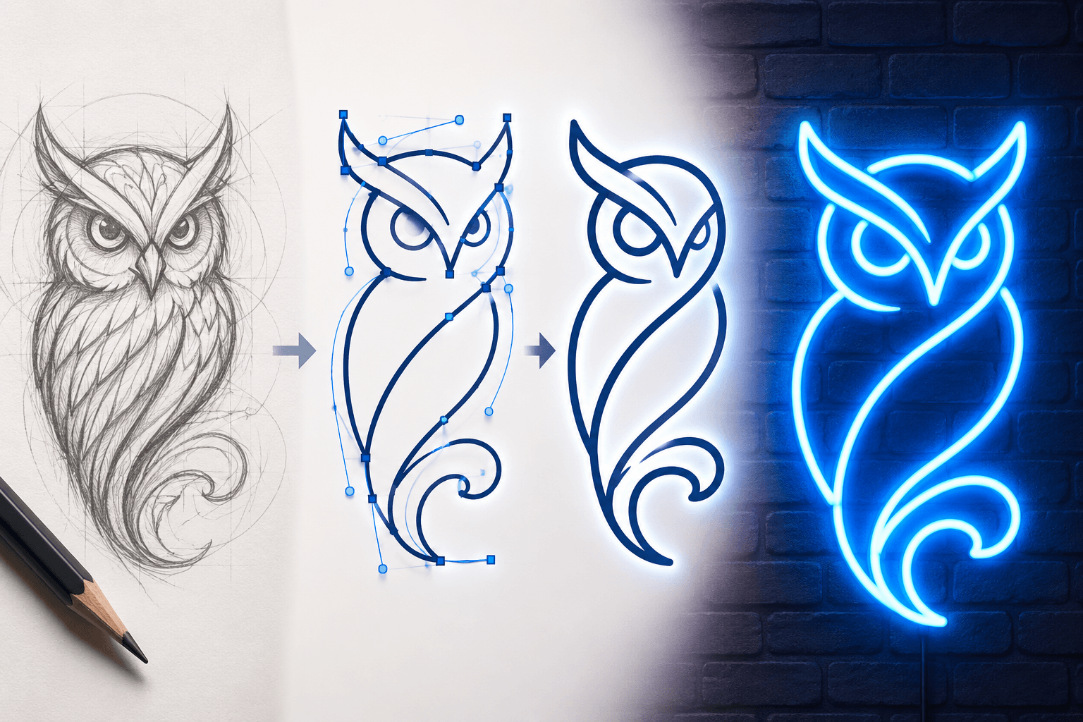
A detailed illustration can often be converted into a simple outline or silhouette. An animal, building, or product image does not need every interior mark to remain recognizable. A few defining lines may be enough.
This approach works well for LED neon in general, since flexible lighting is better suited to smooth curves and clear outlines than tiny patterns. If your logo includes text or artwork that needs this kind of rework, it helps to find out how to design a neon sign from text or artwork before you finalize the file.
Make Text Easier to Read
Small lettering is one of the main difficulties when adapting a logo. Thin serif fonts, tightly connected scripts, and condensed letters may become unclear when lit.
The design may need:
- Larger text
- Thicker letter strokes
- More space between characters
- A cleaner version of the original font
- Removal of a small tagline
Readability matters most for signage placed in storefronts, reception areas, restaurants, or offices, where customers should be able to identify the company without standing directly in front of the sign. Font choice plays a big part here, so it's worth taking a moment to check which fonts work best for neon signage before you commit to a layout.
A font can be adjusted without completely changing its style. The aim is to retain the brand's character while making each letter clear.
Limit Colors and Remove Gradients
A digital logo may use gradients, transparency, metallic finishes, or many shades of one color. LED neon uses defined illuminated colors, so these effects generally need to be converted into solid tones.
Choose the primary brand color first. Add a second shade only when it helps separate the icon from the text. Too many colors can make a smaller sign look busy.
The same planning applies to any personalized sign, where the final color combination should be easy to see against the wall or backdrop. NeonChamp can suggest available shades that closely represent the original brand colors, or you can pick the right glow color for your sign yourself before placing an order.
Select a Size That Fits the Logo
More detail requires more space. A larger sign gives letters, curves, and separate elements enough room to remain clear. Reducing a detailed logo to a very small size may force the removal of important features.
Before ordering a neon sign, consider:
- Available wall space
- Logo shape and proportions
- Viewing distance
- Indoor or outdoor placement
- Nearby furniture or displays
- Background color
Avoid choosing a size based only on price. A sign must be large enough to present the logo properly in its intended location, so it helps to figure out the right size for your neon sign before you finalize a layout.
Adapt the Design for Its Intended Use
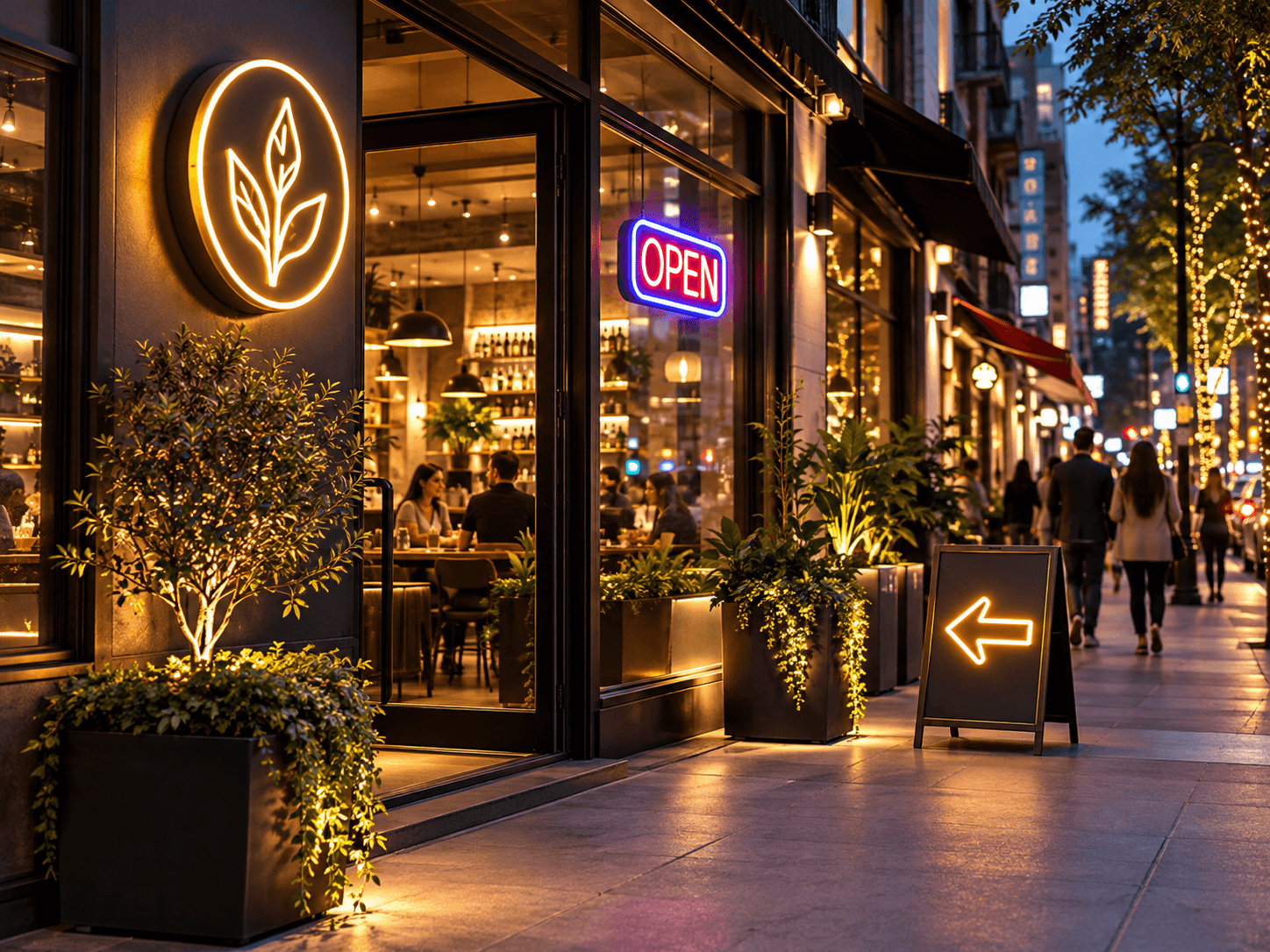
The installation area should guide the final design. A storefront logo must be visible from farther away, and a sign behind a reception desk can include slightly more detail.
The setting can also determine which part of the artwork should receive priority. Open signs need immediate readability near an entrance, and a gym sign may require bold lettering that stays visible under bright interior lighting — if that's your project, it's worth seeing how other owners outfit their home gym with a custom neon sign for ideas on scale and placement.
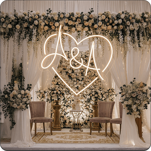
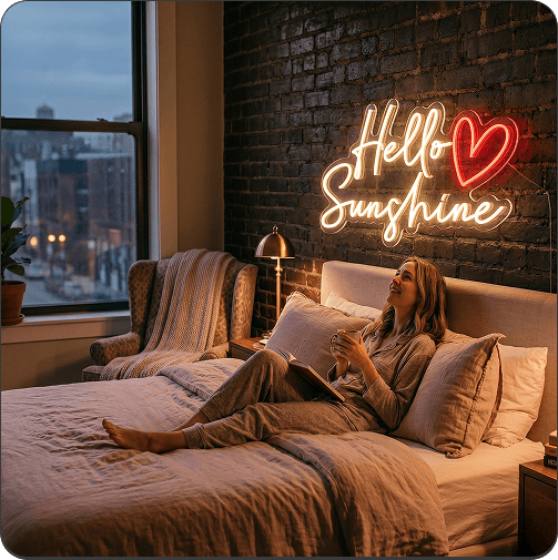
Other uses come with their own requirements. Restaurant owners who add a neon sign to their restaurant usually need it to work with the venue's existing lighting, while event signage needs to stay clear in photographs. Couples planning custom neon signs built for their wedding often use a simplified monogram, and signs for bedroom walls tend to work better with softer colors and compact designs.
Smaller brand icons can also be adapted into home decor pieces, and short company messages can become motivational signs for offices or studios.
Upload the Best Available Artwork
Vector files such as AI, EPS, or SVG are preferred because they can be resized without becoming blurry. A high-resolution PNG with a transparent background may also work. Screenshots and compressed social media images provide less detail for production.
When sending artwork to NeonChamp, include:
- The original logo file
- Preferred dimensions
- Brand color references
- Installation location
- Required design elements
- Details that may be removed
- Indoor or outdoor requirements
These instructions help the design team prepare a more accurate mockup and reduce unnecessary revisions. If you want to preview changes yourself first, you can design your own neon sign online before submitting the final files.
Check the Simplified Version Before Approval
Compare the mockup with the original logo before approving production. Check the shape, spelling, spacing, colors, and proportions. View the design at different sizes to confirm that it remains recognizable from a distance.
The final sign should look like an illuminated version of the existing brand rather than an unrelated redesign. If removing an element makes the company harder to recognize, that element should remain or be redrawn more clearly.
Frequently Asked Questions
Can Every Detailed Logo Become an LED Neon Sign?
Most logos can be adapted. Photo-based artwork, tiny patterns, and detailed gradients may require greater simplification than clean text or outline-based logos.
Will Simplification Change the Brand Identity?
Careful simplification protects the main icon, company name, colors, and proportions. It removes only the details that would not display clearly in LED neon.
Can a Logo Neon Sign Use Several Colors?
Yes, but limiting the palette often creates a cleaner result. Two or three colors can separate important sections without making the sign difficult to read.
Turn a Complex Logo Into a Clear Neon Display
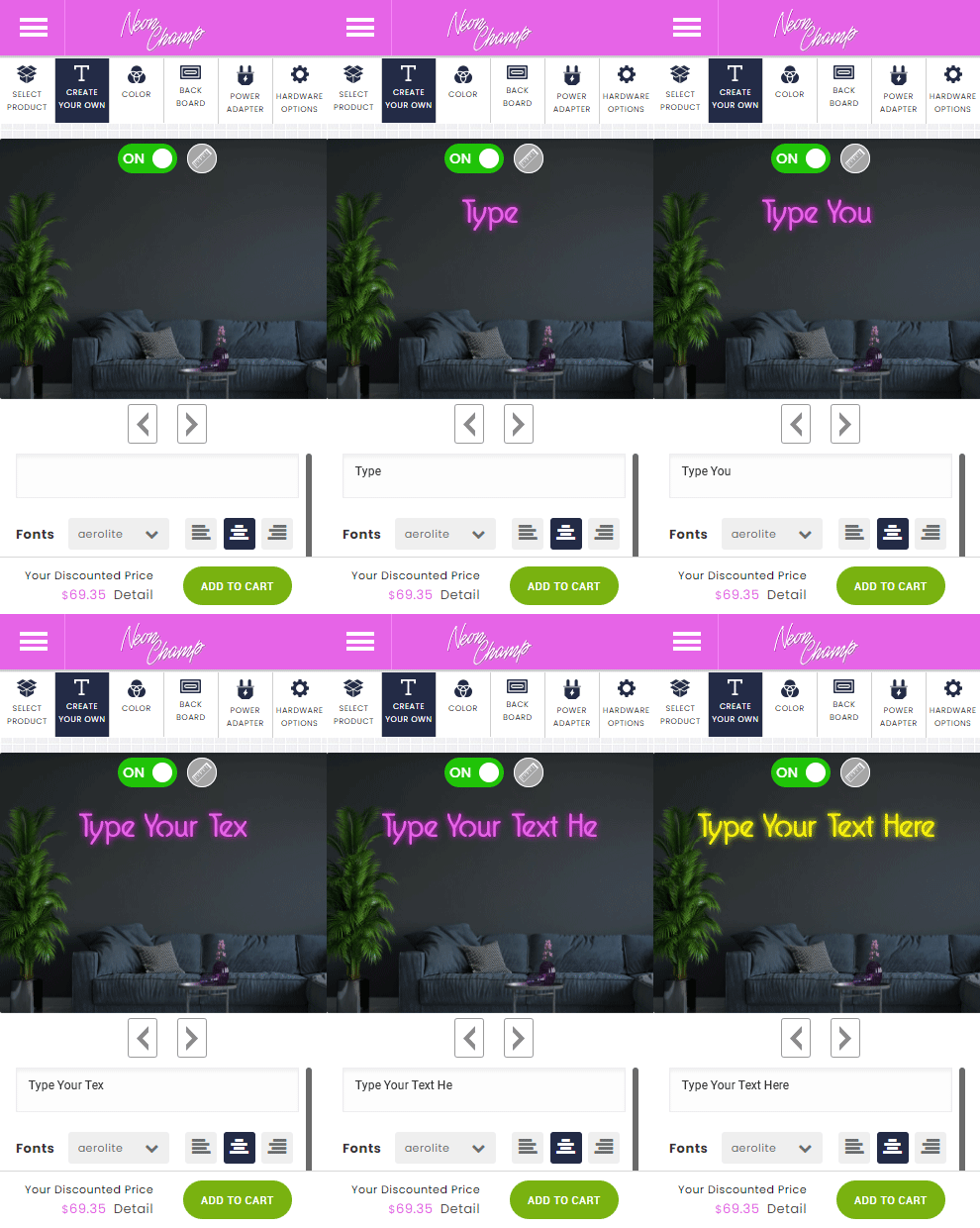
A detailed logo can become an effective LED neon sign when its strongest features are protected. Clear outlines, readable text, proper spacing, suitable colors, and the right dimensions help the illuminated version remain connected to the original brand. Before you place an order, it's worth taking a few minutes to run through everything to check before buying a neon sign so the finished piece matches what you had in mind.
NeonChamp works with uploaded artwork to prepare logo-based signs for homes, events, and commercial locations. With careful simplification, a complex design can become a clear and recognizable lighted display.
Get 25% OFF on All ProductsCode:NEON25View Offers!
Neon Collection50% OFF