
 we're online
Personalized Neon Signs: How to Design One Online in Minutes
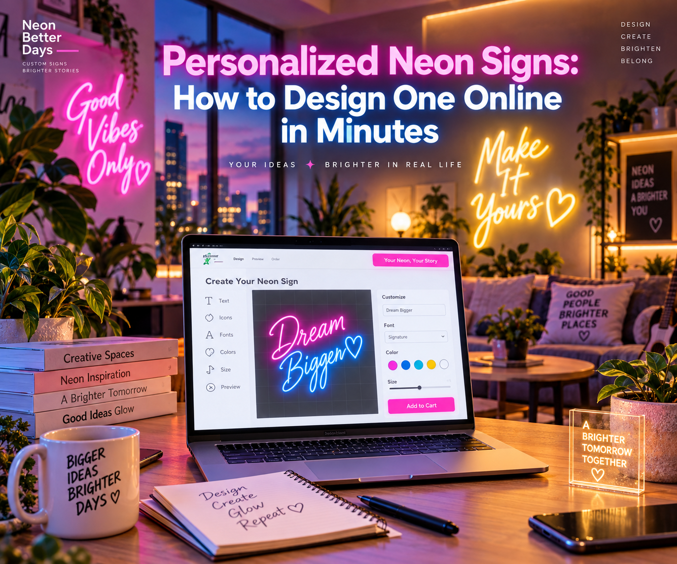
Personalized neon signs let you turn a name, phrase, date, or short message into illuminated wall decor. An online designer makes the process easy by showing how your choices may look before you place an order.
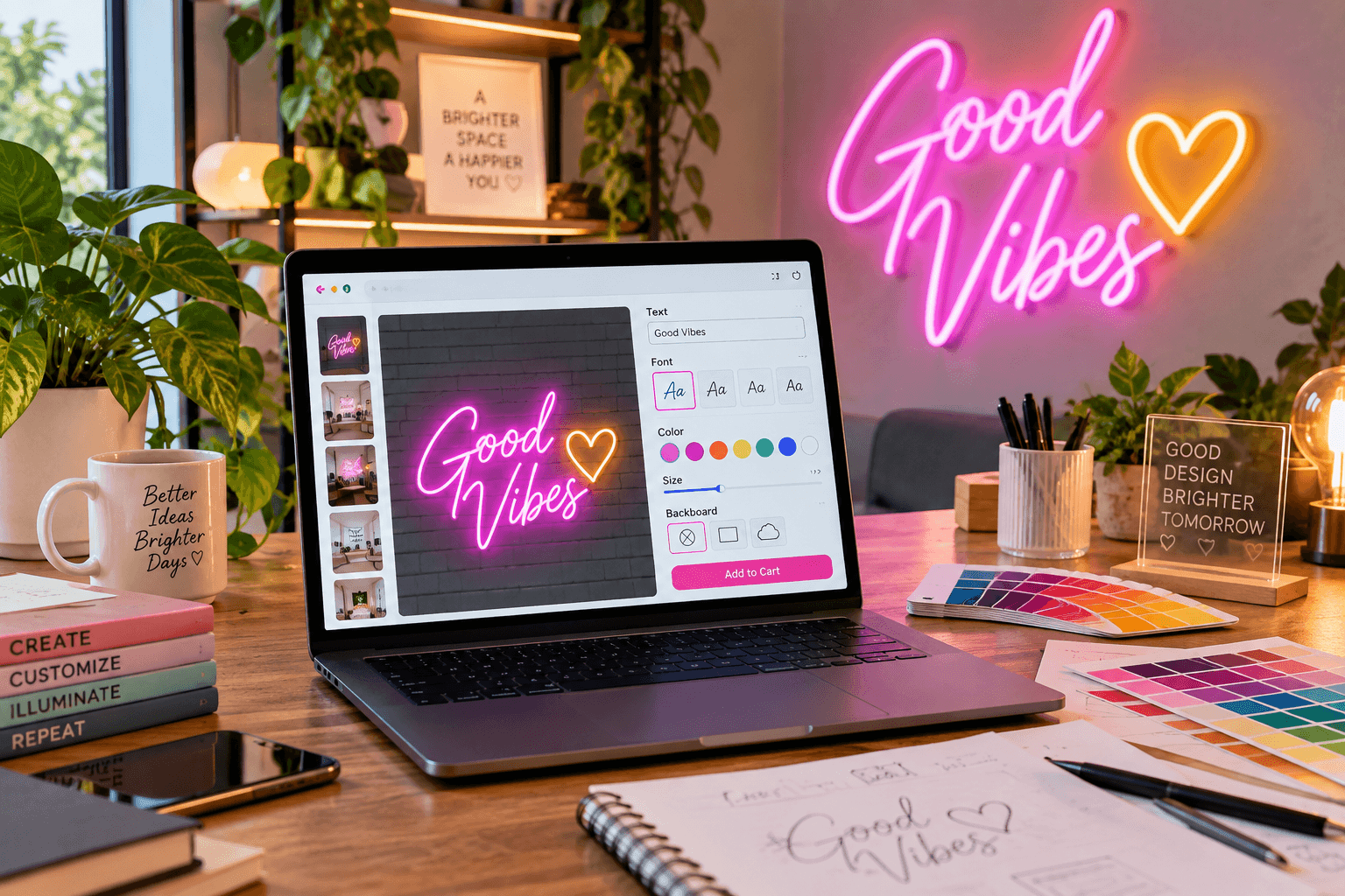
You can enter your wording, compare fonts, test colors, adjust the size, and review the estimated price without installing design software. This guide explains what to expect from an online customizer and how to produce a clear, readable design in a few minutes.
What Makes a Neon Sign “Personalized”?
A personalized sign contains details chosen for a particular person, room, memory, or occasion. Instead of buying a ready-made phrase, you decide what the sign says and how it looks. If you're stuck on wording, what should my neon sign say has ideas to get you started.
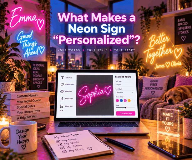
Common personalized elements include:
● A first name, surname, or nickname
● Initials or a monogram
● A short quotation
● A wedding or birth date
● Coordinates of a meaningful location
● A family phrase or private joke
● A handwritten word or signature
Text-based designs are usually the quickest to create with an online tool. A drawing, handwriting sample, or detailed symbol may require an artwork upload and a manually prepared proof.
The customization options may also cover size, font, LED color, backing shape, mounting style, and brightness controls. Review every available option because some selections can change the dimensions or price.
Using an Online Neon Sign Designer: What to Expect
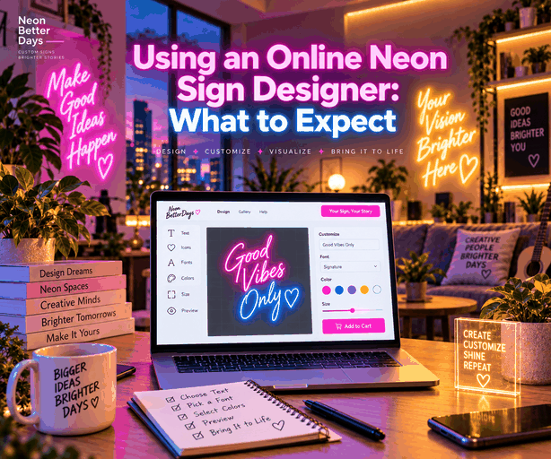
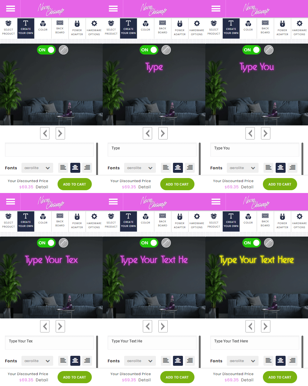
An online designer provides a visual starting point for your sign. Most tools guide you through the main choices needed to create your own neon sign.
A typical process includes:
1. Enter your wording.
2. Choose a font.
3. Select an LED color.
4. Pick the required width or size.
5. Choose a backing shape.
6. Select wall mounting or hanging.
7. Add a remote, dimmer, or other accessory.
8. Review the preview and price.
9. Submit the design or continue to checkout.
Use the online neon sign designer to test your wording before ordering. If the tool cannot reproduce your idea, look for an artwork-upload or quote option rather than forcing a detailed design into a basic text customizer.
The on-screen preview is a guide. The manufacturer may provide a separate digital proof showing the final layout, dimensions, backing, and electrical setup before production.
Typing Your Text and Previewing It Live
Start with the exact wording you want on the finished sign. Check capitalization, apostrophes, numbers, and punctuation. The manufacturer may follow the approved text exactly, so a small typing error can become part of the final product.
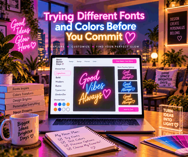
Try the message on one line first. If it becomes too wide, test a two-line layout or shorten the wording. Long phrases can require smaller lettering, which may reduce readability.
The live preview can help you compare:
● Uppercase and lowercase lettering
● One-line and two-line arrangements
● Short and long versions of a phrase
● Different sign widths
● Backing shapes
● Approximate price changes
Reduce the preview size on your screen to see whether the message remains clear from a distance. If it becomes difficult to read, simplify the wording before continuing.
Trying Different Fonts and Colors Before You Commit
Font choice affects the sign's personality and readability. Script fonts can feel personal and relaxed, whereas block fonts create stronger letter shapes. Some thin scripts look attractive in a preview but become less clear when illuminated from across a room.
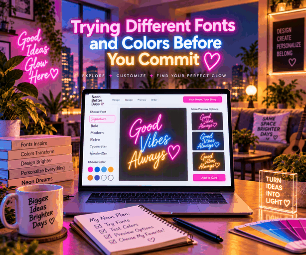
Test several fonts using the same text. Pay attention to letters that touch, overlap, or look similar. Names containing repeated narrow letters may need a heavier style or more spacing.
Color should suit the display area and desired mood. Warm white can create a soft bedroom look, and cool white may feel clean and modern. Pink, blue, red, green, orange, and purple can add a stronger decorative effect.
Font and Color Quick Picks
|
Style Goal |
Font Direction |
Color Direction |
|
Soft, personal, bedroom feel |
Script or handwriting-style font |
Warm white, pink, or soft purple |
|
Clean and modern |
Block or sans-serif font |
Cool white or blue |
|
Bold and energetic |
Heavier block font with wide spacing |
Red, orange, or multi-color |
|
Storefront or business use |
Simple, high-contrast font |
Colors matching brand palette |
Read the neon sign font guide and neon sign color guide for detailed comparisons. This article focuses on using the customizer rather than selecting one font or color for every design.
Popular Personalization Ideas
The easiest ideas begin with one meaningful detail. A short message generally produces a cleaner result than several unrelated elements.
Names, Initials, and Quotes
Names are popular for bedrooms, home offices, gaming areas, dorm rooms, and party backdrops. Couples may choose a shared surname or paired initials, and families may use a phrase associated with their home.
Short quotations also work well when they can be understood immediately. Options include a favorite greeting, two- or three-word reminder, song-title reference, or family saying.
Avoid entering a full paragraph. More words require more tubing, wider backing, or smaller letters. A concise phrase is usually easier to read and may also cost less. Our guide on turning a name, quote, or drawing into a custom neon sign walks through this in more detail.
Dates and Milestones
Dates can mark weddings, engagements, anniversaries, graduations, births, or moving into a new home. They can appear alone or beside names and initials.
Confirm the month, day, and year before ordering. Choose one date format and check whether separators and numbers remain clear in the selected font.
Personalized neon signs can also be reused after an event. A wedding surname sign may move into the couple's home, and a graduation sign can become bedroom or office decor.
Popular Personalization Ideas at a Glance
|
Idea Type |
Examples |
Best For |
|
Names and initials |
First name, surname, monogram, paired initials |
Bedrooms, gaming rooms, dorm rooms, couples |
|
Short quotations |
Greetings, family sayings, song-title references |
Living rooms, offices, party backdrops |
|
Dates and milestones |
Wedding date, birth date, anniversary |
Weddings, nurseries, anniversary gifts |
|
Coordinates or locations |
Latitude and longitude, city name |
Travel-themed decor, keepsake gifts |
Tips for a Design That Reads Well When Lit
A good custom neon sign design should remain clear when illuminated and viewed from its normal position. Use these checks before approving your sign:
● Keep the message short
● Choose a font with clear letter shapes
● Avoid several thin lines placed close together
● Use strong contrast between the light and wall
● Select dimensions based on viewing distance
● Leave enough space between two lines of text
● Check similar-looking letters in the selected font
● Use one main color unless several colors have a purpose
● Measure the wall before selecting the sign width
● Review the design at a smaller screen size
● Confirm the final dimensions on the proof
● Check spelling again before approval
Use painter's tape to mark the proposed width and height on the wall. Step back to the normal viewing position and decide whether the size feels balanced with the furniture and decorations around it.
If the design will appear in photographs, check whether its color remains visible against the intended backdrop. Very bright rooms may reduce the visible glow, and a wall similar to the LED color may weaken contrast.
Do not judge size only from the online preview. A design may fill your computer screen but appear small when installed above a bed, sofa, or party table. The listed measurements provide a more reliable guide.
FAQs
Can I create my own neon sign design online?
Yes, most online neon customizers allow you to enter text, choose a font and color, select a size, and view a live preview before checkout. More detailed artwork, handwriting, or symbols may need to be uploaded so the seller can prepare a separate digital proof.
What personal messages work best on a neon sign?
Short names, initials, dates, and high-contrast phrases usually work best because they remain readable when illuminated. Long messages and very thin script fonts may require smaller letters or tighter spacing, making the finished sign harder to read from a distance.
Can I change the color after seeing the preview?
Most online design tools let you switch between available colors and fonts before adding the design to your cart or submitting it for a quote. Review the final proof carefully because changes may no longer be possible after you approve the design and production begins.
Get 25% OFF on All ProductsCode:NEON25View Offers!
Neon Collection50% OFF